If you ask us, infographics aren't going anywhere. Their topics are vast and their formats are many, but this year, we truly saw some excellent examples of informative design. 10 of the Best Infographic Examples of 2016 Music is known to enhance many situations. Plus, the accompanying images help us to process exactly what each number conveys, and reinforces the danger of each fact. Save Save We are definitely preachers of vacation -- how to relax when you're there, how to catch up on email when you're back, and how many of us feel too guilty to take one. While Classy snuck in a few highlights into this infographic on #GivingTuesday, the primary color scheme is a festive red and green combination -- which aligns perfectly with the "Home Alone" theme. But what makes them so successful? We're delighted by the design of this visual. At the same time, each vocabulary word has a clever visual representation next to the written definition, which helps to keep the image from looking too text-heavy. And while we don't love the errors of website redesign outlined in this visual, we do like the way they're represented.
If you ask us, infographics aren’t going anywhere.
This year alone, we’ve covered how essential they are to SEO, and the numerous resources available to create beautiful infographics of your own.
And yes — when it comes to infographics, we do like to play favorites.
That’s why we went scoured the web for some of the best infographics of 2016. Their topics are vast and their formats are many, but this year, we truly saw some excellent examples of informative design.
Have a look and let these examples inspire you. Who knows — with all of those resources and a new year around the corner, they might help you create of the best infographics of 2017.
10 of the Best Infographic Examples of 2016
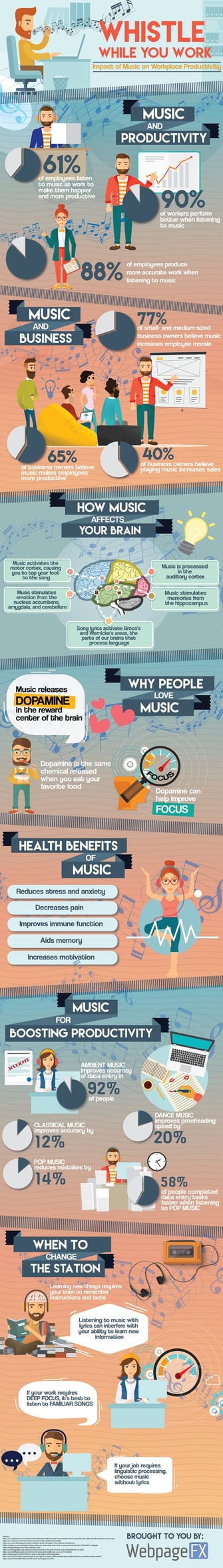
Music is known to enhance many situations. It livens up a party, gets us through a brutal workout, and can make a long commute seem quicker. But did you know that it can also make you more productive? WebpageFX collected these science-backed reasons why music can help you get your work done, and worked them into an infographic that delights us.
This infographic does a nice job of balancing two different color sets — a best practice, according to Marketing Consultant Brian Downard’s infographic design playbook. Downard encourages the use of soft, subtle colors in the background, with pops of color in the foreground to highlight important elements. As you can see below, this approach results in a really clean design.
Beyond the color palette, the folks at WebpageFX did a nice job of following through with the theme, with various musical notes and other symbols that represent a melodic sound. Speaking of symbols, take note of how they used the image of the brain to break down how music stimulates and activates specific sections.
Save
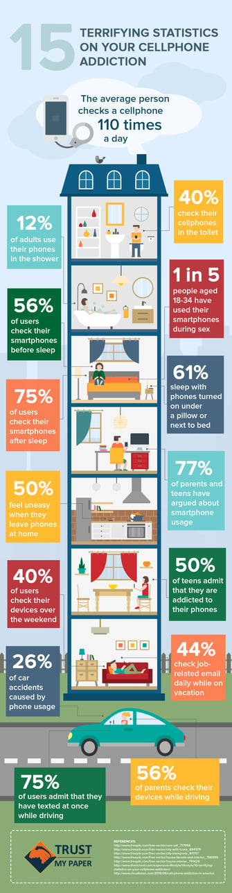
There’s so much information out there about the drawbacks of overusing our mobile devices. They make us lose sleep. They facilitate email addiction. But very rarely, it seems, can we find all of this information in one place — until now.
Trustmypaper created this infographic, which packs 15 eye-opening statistics in a condensed yet engaging format. Plus, the accompanying images help us to process exactly what each number conveys, and reinforces the danger of each fact.
As for the font, it’s more than legible, but isn’t so big that it doesn’t fit in with the overall design scheme. According to a Kissmetrics article from Henneke Duistermaat and Neo Mammalian Studios, poor font choice is one of 19 infographic red flags, and while it may seem obvious, you’d be surprised how many brands just don’t get it right.
Save
Save
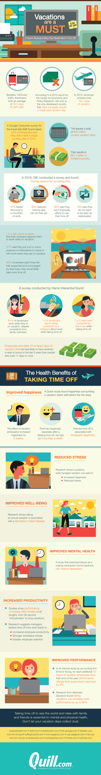
We are definitely preachers of vacation — how to relax when you’re there, how to catch up on email when you’re back, and how many of us feel too guilty to take one. But it’s a must — and this infographic explains why.
From the good, to the bad, to the ugly, Quill makes great use of imagery here. The infographic uses a generally bright color palette, to reflect the lightness of vacation. The “happier” images incorporate the benefits, too. But when it comes to the negative impacts of not taking time off, the pictures don’t hide them — even if it’s a cartoon, we can sense the annoyance of the characters that work or receive a call from the office during their time away.
Save
Save
Some of us have a tendency to chronically expect the worst. (Cough — guilty.) But chronically worrying isn’t good for you — from heart disease to memory loss, all of that stress can take a toll on one’s health.
So how do we knock that off? It turns out that there are some fairly simple, science-backed steps to decreasing our anxiety and worry, which Happify has organized into an easy-to-follow infographic. It even has a delightfully helpfully step on figuring out when and how to let go of our negative thoughts, and when…
COMMENTS