
How to Improve a Website Use white space. Keep your website pages consistent. According to Section.io, an extra five seconds of page load time can increase your website's "bounce rate" by more than 20%. Google offers a free service where you can get information on your page speed. To improve your page speed, start by compressing all your images before loading them onto your website. Calls to actions (CTAs) that are clearly marked with an action word enable your website users to more easily navigate your site and get exactly what they want in the location they expect to find it. Check out this infographic on real images versus stock photography. But more importantly, headings guide your user through the site, making it easy to scan through and find content that speaks to them directly. Keep your website pages consistent. Recently, Google started penalizing sites that aren't optimized for mobile devices, making the need for responsiveness even more crucial.

Website User Experience
Your website is the core anchor for your digital marketing efforts. Designing a great website user experience requires understanding the problems different visitors have to solve.
In today’s marketing landscape, your website has become a more powerful tool than ever. Your website is a 24/7 salesman, and as such, it has the potential to be your most powerful asset and the centerpiece of your marketing efforts.
However, rapidly changing digital trends can make your website feel old and outdated. While sometimes a redesign might be ideal, you may not have the time or money to invest in such a large project. To help you overcome this challenge, we’ve put together a list of 10 simple ways you can improve your website to make it more helpful and useful.
How to Improve a Website
- Use white space.
- Optimize your page speed.
- Use attractive calls to action.
- Use hyperlink differentiation.
- Segment key information with bullet points.
- Use images (wisely).
- Include well-designed and written headlines.
- Keep your website pages consistent.
- Catch your 404s.
- Be responsive and mobile-friendly.
Your website is the core anchor for your digital marketing efforts. Designing a great website user experience requires understanding the problems different visitors have to solve.
1. Use white space.
On more than one occasion I have heard clients complain that there was too much white space on their site and that this unused real estate ought to be used for advertising more of their services. However, white space is essential to good design. White space makes your content more legible while also enabling the user to focus on the elements surrounding the text.
According to Crazy Egg, white space around text and titles increases user attention by 20%. White space can also make your website feel open, fresh and modern and if your branding is consistent with these then it can help you communicate that feeling to the user. One downside of white space to keep in mind, however, is that it does indeed take up space.
If you’re trying to get a lot of content above the fold (above the part that is immediately visible without scrolling) having too much white space might be replacing some valuable information. The key is to find the balance between what is most important to communicate at the top and surround that with some space to highlight the image and/or text.
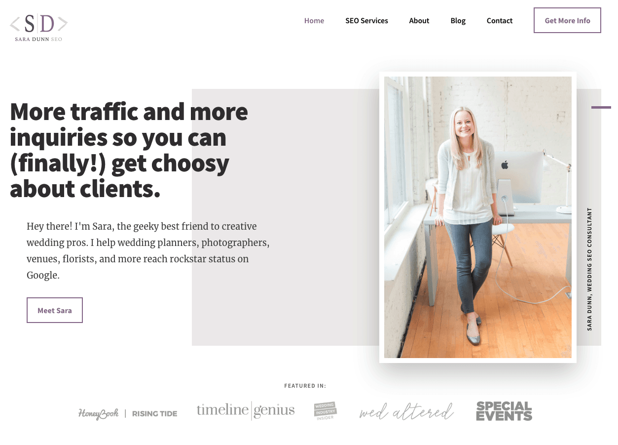
Consider the website, Sara Does SEO, by Sara Dunn. In her UX, there is a lot of white space right from the start, pulling your attention to what Sara looks like and what can do for you. This allows the reader to focus her attention on the most important things. Each section of the homepage also provides one clear header and a few supporting points, making it easier to digest information.
Check out her website below.
2. Optimize your page speed.
One of the most frustrating experiences for users of the web is waiting for a page to load for too long. With the rise of the mobile devices, people are accessing content all over the world on many different platforms. While browsing online at Starbucks or while watching TV on their laptop, they expect a fast result for the content that they want.
When they don’t get it, they usually bounce. Slow page load is an interrupting experience for the user and it can be a source of frustration and often users simply don’t have the time to wait.
According to Section.io, an extra five seconds of page load time can increase your website’s “bounce rate” by more than 20%. Whoa.
So, where do you go from here? Get your score. Google offers a free service where you can get information on your page speed. Google will also offer you some suggestions for improving your load time on Mobile and Desktop.
To improve your page speed, start by compressing all your images before loading them onto your website. Image file size is one of the leading causes of a slow page speed — using websites like compressor.io can help you dramatically speed up each webpage you own.
Learn more about decreasing your website’s bounce rate in this blog post.
A great example of speedy load is Barnes and Nobles. No matter what device your own Barnes and Nobles loads quickly. Taking the extra caution to load some important elements first so that you know that the content is on its way. See for yourself.
3. Use attractive calls to action.
Your customers are already accustomed to following visual cues to determine which content is important to them. Calls to actions (CTAs) that are clearly marked with an action word enable your website users to more easily navigate your site and get exactly what they want in the location they expect to find it.
In creating buttons for your website you should think about color and the psychology of color. In a study done by Maxymiser, researchers were shocked to find that hey achieved an increase of 11% in clicks to the checkout area of the Laura Ashley website, by testing color variations and action messaging. Different colors evoke different messages. Think about the message that you want to evoke for a user (trust, experience, intelligence) and choose your colors wisely.
A second thing to consider is the actual words you use for your buttons. The words should include a verb or an action word that excite the user to do something. Choosing the right words or…
COMMENTS