What is web form layout? Web form layout is the way in which all aspects of your form are arranged and where the form is placed on a given web page. Why does web form layout matter? Use a single-column layout When it comes to your layout, you should keep the location and order of all your fields as straightforward as possible. This way, you decrease the amount of time your visitors need to work through your form and there’s no possible cause for error or confusion. If you aren’t using inline form field labels (which are located directly in the form fields themselves), you should also align your labels to the left. Again, this natural flow will help your visitors complete your form more efficiently without feeling confused about which label belongs to which field. Use a one-page layout When creating your forms, you should use a one-page layout so there’s only one form located on each page. Add inline form field labels Inline field labels and text make it exceptionally easy for visitors to understand where they should be placing their responses in your forms. Sometimes when the field labels are located above, below, or to the side of the fields, it’s hard to determine which label belongs to which field.

Have you ever tried completing a form on a website and felt confused or lost while doing so? Did the placement of the form field labels and the fields themselves not make any sense? Were the form’s title and submission button not in locations that were easy for you to spot?
These factors, among several others, are major aspects of a web form’s layout that have the potential to either enhance or diminish its user experience (UX). By implementing a successful layout, you’ll create a great experience for your visitors as well as initiate a positive — and hopefully long-lasting — relationship between them and your brand.
In this guide, we’ll review six best web form layout practices as well as examples of each practice to help you get started. But first, let’s review what web form layout actually is and why it’s so important.
What is web form layout?
Web form layout is the way in which all aspects of your form are arranged and where the form is placed on a given web page. Your web form’s layout should be thoughtfully organized and look both simplistic and professional.
Why does web form layout matter?
Almost every website has a web form of some kind. Your web form layout plays a large role in how well your form converts. That’s because a great form layout leads to seamless form completion and improves the submission process for your visitors. Visitors will easily convert since you’ve created a web form that’s hassle-free and feels both professional and thoughtful.
In contrast, a poorly planned layout will lead to a confusing and difficult-to-work-through form that may frustrate your visitors and even cause them to abandon your site entirely, diminishing your conversions.
Now that we understand why getting your web form’s layout right is so important, let’s dive into how to create an optimal layout for your web form. Below are six best practices to follow when arranging your content.
Form Layouts: 6 Best Practices and Great Examples to Follow
We’ve curated this list of best practices, to apply to virtually every type of web form. We’ve also included great examples of each practice to help you better apply the concepts to your own forms.
1. Use a single-column layout
When it comes to your layout, you should keep the location and order of all your fields as straightforward as possible. This means you should use a single-column layout. By organizing your fields this way, your visitors won’t miss a field, they’ll complete the fields in the order that makes the most sense, and they’ll be able to submit your form faster than they would if you used a multi-column form.
Great example:
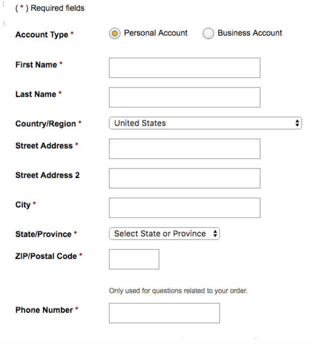
This example shows you what a single-column format should look like. The layout is just about as streamlined, straightforward, and minimalist as it could possibly be, which is exactly what you want. This way, you decrease the amount of time your visitors need to work through your form and there’s no possible cause for error or confusion.
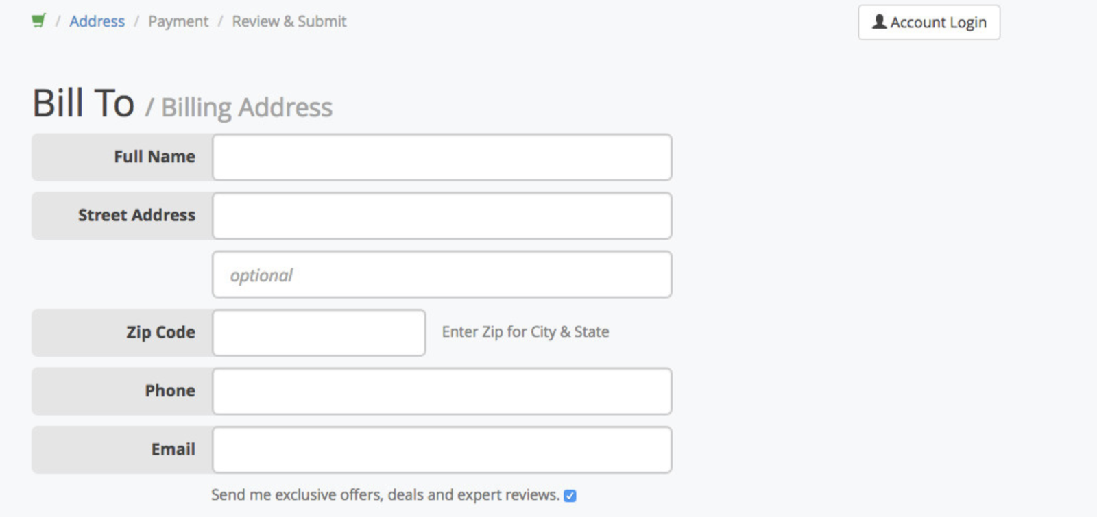
2. Align copy to the left
Align all of your form fields to the left side of the web page. This is the most natural way to lay out your form because it’s how the vast majority of people learn to read content — by moving from right to left. If you aren’t using inline form field labels (which are located directly in the form fields themselves), you should also align your labels to the left. Again, this natural flow will help your visitors complete your form more efficiently without feeling confused about which label belongs to which field.
This photo depicts…
COMMENTS