
But if you want to design a homepage that converts, you have to look at how visitors navigate through your pages. But I’m referring to headlines and labels with terms like: who we are what we do about our hiring process places we work While this information should be included on your website, it shouldn’t be the focal point of your design. I don’t want you to think your brand story isn’t important. Using a standardized page layout will help you drive conversions. Conflicting CTAs Having call-to-action buttons on your website is necessary to drive conversions. Unless they are all on the same screen at the same time. Square has perfectly designed its navigation to ensure that website visitors always have an option to convert. That way, when a visitor scrolls, the menu is visible at all times. Consider all the design elements on your checkout page. When you optimize your mobile site, you need to make sure it encompasses all the previous design elements we discussed: labels that drive conversions standardized layout similar CTAs no clutter scrolling-friendly To check whether your mobile site is properly optimized, you can use tools such as the mobile-friendly test from Google: But just because the site is mobile optimized doesn’t mean all your navigation elements are perfect.
I see this problem all the time when I’m consulting businesses. They are getting tons of traffic to their websites, but visitors just aren’t converting.
If this sounds like your situation, don’t hit the panic button yet.
Look on the bright side. At least you’re having success when it comes to driving people to your website. But if you want to design a homepage that converts, you have to look at how visitors navigate through your pages.
Every day I see websites with design flaws.
Brands spend much time trying to improve their SEO rankings and don’t spend enough effort improving their websites. Creating a website that converts isn’t an overnight process.
This takes time, effort, and patience. You need to learn how to run A/B tests and analyze your design elements so that you can make calculated improvements.
That said, there are certain changes you can implement sooner rather than later.
I’ve taken the time to identify the top 7 navigation mistakes I see on a regular basis. Use this list to analyze your existing website to make sure you’re not making the same blunders.
1. Labels and headlines that don’t drive conversions
When someone visits your website, it’s all about making a first impression. Think about what people see on your menu bar and headline tags.
I don’t like to throw businesses under the bus. So I’m not going to show you a specific example of a website that’s doing this wrong. But I’m referring to headlines and labels with terms like:
- who we are
- what we do
- about our hiring process
- places we work
While this information should be included on your website, it shouldn’t be the focal point of your design. None of these will lead to conversions.
Let’s take a look at a brand that understands this concept and has appropriate labels and headlines on its site. Check out the homepage for Knockaround:
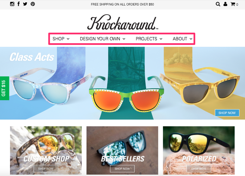
We read from left to right, so the first two choices we see are “shop” and “design your own.” Both of those labels were written to help drive conversions.
Information about the brand’s history, staff, and operation are reserved for the “about” headline.
I don’t want you to think your brand story isn’t important. In fact, I’ve written an extensive guide on how to create an about us page that generates leads.
But when it comes to driving conversions, you need to shift your focus. Nearly all the clickable links in the example above from Knockaround will drive conversions.
The website has a clean and simple design, so it’s easy for visitors to be drawn to these conversion buttons. The result is increased sales.
2. Using a non-standardized layout
People have been browsing the Internet for years. Over time, there are certain standards we have grown to expect when we land on a web page.
It’s important for you to come up with a differentiation strategy for your marketing campaigns to help you stand apart from your competition. But when it comes to your website navigation, stick with a standard layout.
For example, where do you expect to see a navigation menu when you visit a new website?
You’ll assume it’s at the top of the screen. Burying your menu in the middle of the screen will look strange for your visitors.
They may not spot it right away, and it’s not something they are expecting to see. Here’s an example of a standardized website layout from Unbounce:
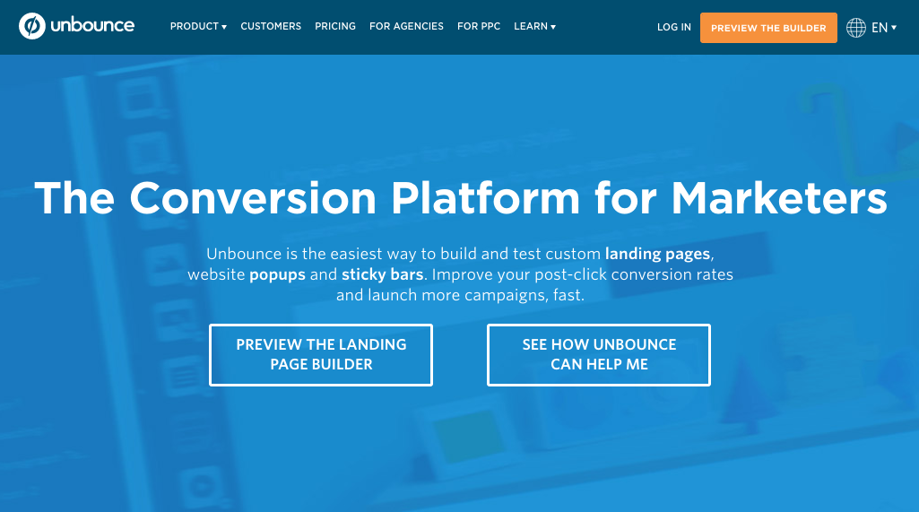
As you can see, it follows the format of most websites you see on a daily basis. The standard typically follows this progression:
- menu bar at top of screen
- large headline
- short description sub header
- CTA button
You might be thinking this is too boring. Think again. Using a standardized page layout will help you drive conversions. Visitors will know exactly where to navigate without having to think too hard.
Let me give you an analogy to further illustrate the point. When you are looking at a picture on your smartphone or tablet, how do you expect to zoom in on the image?
You use two fingers on the screen and spread them apart. That’s what you’ve grown accustomed to.
But what if that command didn’t work for certain websites? You’d be thrown off and probably wouldn’t convert. Plus, you’ve been using smartphones for far less time than you’ve been browsing the Internet.
So stick with what people are familiar with, and don’t stray too far from a standard layout.
3. Conflicting CTAs
Having call-to-action buttons on your website is necessary to drive conversions. But too many CTAs not related to each other will confuse the visitor.
Most people think that adding multiple CTA options to each page of their websites will increase the chances of one getting clicked. But it actually has the opposite effect.
These are the typical CTAs:
- buy now
- sign up today
- join our email list
- refer a friend
- click here to receive your discount
What’s wrong with these CTAs? Nothing. Unless they are all on the same screen at the same time.
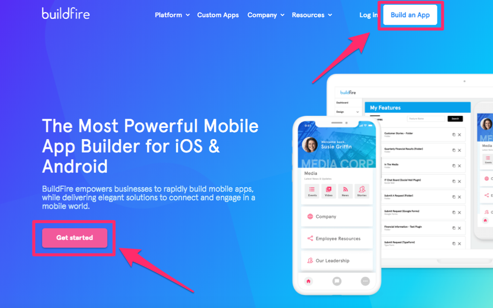
Take a look at the BuildFire homepage:
COMMENTS