Content Marketing: 4 Ways to Make Sure Your Mobile Content Connects. Reports show that 65% of digital media time is now spent on a mobile device. We tend to put the most important information on the top and down the left side. On a mobile device, though, interstitials tend to lead to bounces. Instead of a pop-up, you can embed your offer in the content as an organic call to action based on what they’re already reading. So it makes sense to add page breaks into content; the more, the better. It’s better to put your content all on one page and let readers scroll vertically through it. Optimize Your Text Mobile users tend to read content in shorter sessions than laptop or desktop users. Break paragraphs every 2-3 sentences. Put the most pertinent information front-and-center, get rid of interruptions, and make the text easy to consume.
How often do you use your smartphone as a phone? Personally, I think of it as more for avoiding human interaction than facilitating it:
These days my desktop and home laptop are gathering dust; I can do it all on my phone. The only reason we still call them “phones” is “personal computation device” sounds too nerdy.
All of which to say: Mobile is the current and next frontier for content marketing. Reports show that 65% of digital media time is now spent on a mobile device. Not only that, all digital growth is now coming from mobile usage—expect to see desktop traffic stagnate or reduce while mobile traffic continues to grow.
So how do you create content that works as well on a 5-inch screen as it does on a 17-inch monitor? Here are a few guidelines.
Focus on the Center of the Screen
Eye tracking studies show that most people read in an f-shaped pattern on a monitor:
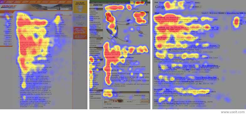
The top left corner tends to get most of the attention, and the outer right edge gets virtually none. This pattern has informed web design for the past decade. We tend to put the most important information on the top and down the left side.
On mobile devices, however, there usually isn’t space for f-optimized content. Eye tracking on mobile shows people focus their attention on the center of the screen and on images.
For content marketers, that means:
- Shorten your headline to fit on one line
- Adjust your header image to put the headline front and center
- Add a short blurb under the headline summarizing the content
If your reader has to swipe, shrink or tap to see your content, they’re likely to hit the back button instead.
Ditch the Interstitials
On a desktop, those pop-up windows with special offers…
COMMENTS