Understand how people read your blog You can be the best writer in the world, but the reality is that people aren’t going to read your content word for word. So if someone is scanning through your blog post, they’ll likely stop at the images. For example, let’s say you’ve got a blog post that’s 3,000 words long. Mark up screenshots Another way to help improve engagement on your blog posts is by showing people how to do something. Here’s another example from that same blog post. Add videos For the most part, we’ve been talking about different types of pictures as visual elements to enhance your blogs. You can add videos to your blog posts as well. In fact, research shows that videos can increase the time spent on your page by more than 100%. I’m sure you’ve got lots of informative video content on this platform. Conclusion If you want to increase engagement on your blog posts, start by adding more visual elements to the page.
A picture is worth a thousand words.
This is a ageless English idiom that I’m sure you’ve heard countless times throughout your life. It’s a simple concept. In short, it means that it’s easier to show someone something than it is to tell them about it.
But are you applying this strategy to your blog posts? Blogging is a science.
There are lots of tips and tricks you can learn to engage with your audience, such as mastering the art of storytelling. However, words alone won’t drive engagement.
You’ll need to learn how to incorporate visual elements into your blog posts as well. If you’ve been reading my blogs for a while, you know that I practice what I preach.
I love using visuals to help improve my content. For those of you who aren’t used to this, it can sound intimidating.
Where do you start? How many visuals should I include? What visuals are acceptable?
These are all valid questions that I can answer for you. Use this guide as a reference for adding visual content to your blog posts. Here’s what you need to know.
Understand how people read your blog
You can be the best writer in the world, but the reality is that people aren’t going to read your content word for word. It’s a fact that you need to accept right now.
According to a recent study, people only read 20% of your content on a page.
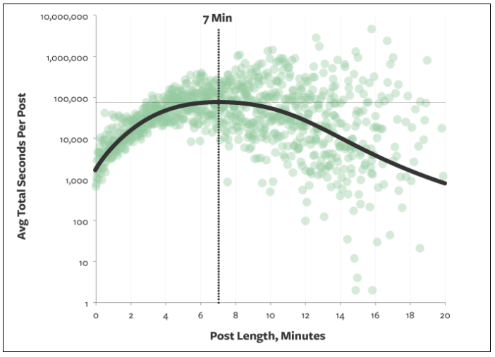
Let that sink in for a moment. Research shows that the optimal blog post will take someone about seven minutes to read.

Typically, seven minutes translates to about 1,600 words, assuming that each word is read (which we already know isn’t the case).
So if your blog post is 1,600 words and only 20% of it gets read, that means visitors are only digesting about 320 words of your content.
What does this information tell you? Simply put, people are scanning your blogs.
So that means that your writing style needs to be adjusted accordingly if you want to increase engagement. Get rid of lengthy paragraphs and large blocks of text. That’s difficult for people to scan.
Instead, use short sentences and stick to paragraphs that are just a few lines long at most.
Add visuals to break up the content.
Visual elements jump off the page at a reader. So if someone is scanning through your blog post, they’ll likely stop at the images. They’ll skim the first few lines before and after the picture to digest your points of emphasis.
You’ve got to be consistent and establish a pattern with your visuals.
For example, let’s say you’ve got a blog post that’s 3,000 words long. You’ve got an image every 300 words or so for the first 1,000 words of the post.
But then you don’t include any more images until the final few paragraphs. That’s a mistake. Refer back to what we just discussed about how people scan.
They’re going to stop at your images. So if they get into a rhythm of scrolling until they see a picture, they’re going to scroll through the majority of your content without stopping if you have such a large gap between each visual element.
Take a look at elements that are included in a typical blog post.

As you can see, the majority of blogs include an image. But that percentage drops down significantly in terms of blog posts with more than one image.
So you can really separate yourself from the crowd by adding lots of visuals to your blog. As you continue reading through this guide, I’ll explain which types of visual content create the most engagement.
Create infographics
As you can see from the images I’ve used so far in this blog post, graphs are a great way to help emphasize a point. There are a few reasons for this.
For starters, it helps validate the message that you’re trying to convey. Graphs also help make your blog posts more legitimate.
This shows your audience that you’re not just making up facts out of thin air. You’ve done the research and used data from high-quality sources of information.
But another reason why you should use graphs is because it helps people retain information. Studies suggest that people only remember 10% of information three days after they hear it.
However, if there is an image associated with that information, three days later people were able to retain 65% of the information.
You want people to remember what you’re telling them. This will definitely boost your engagement.
Instead of just using graphs and statistical data from sources…

COMMENTS