It all starts with the homepage: The first page many people will see when they come to your website. How have other companies redesigned their homepages for the holidays? 2) PayPal Who ever said online money transfer websites can't have fun at the holidays? Bean shares a list of holiday gift ideas featuring some of its most popular and beloved products. This homepage reminds visitors to be prepared for fun with their families. Crew's holiday homepage goes above and beyond expectations for a clothing store. The simple red banner draws attention to their holiday shopping CTA and reminds people to think about products their friends and families might want. The primary CTA is to "Shop The Gift Guide," which leads visitors through all of the products with descriptions that suggest who they might purchase it for, making it easy for shoppers to imagine their family and friends using the product. HP's homepage is another example of a site keeping the page minimally decorated with only their featured video, "Reinvent Giving," above the fold. What great homepage redesigns have you see this holiday season?
It all starts with the homepage: The first page many people will see when they come to your website. How have other companies redesigned their homepages for the holidays? Let’s take a look.
Note: Businesses change their homepages on a regular basis. The examples below may not be current.
15 Holiday Homepage Designs to Get You in the Spirit
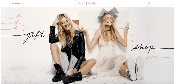
1) Free People
When your business has a loud personality like American bohemian retail company Free People does, making a big first impression on your homepage can be a great thing. Free People’s redesign is all-encompassing, starting with a large, high-definition image of models wearing some of its latest festive holiday apparel.
We especially love the whimsical, fun font it used in the headline, “The Gift Shop 2016.” For certain brands, decorative fonts like these can be a great seasonal touch to the style of your homepage. (Get tips for using fonts in your web design in our free do-it-yourself design guide.)
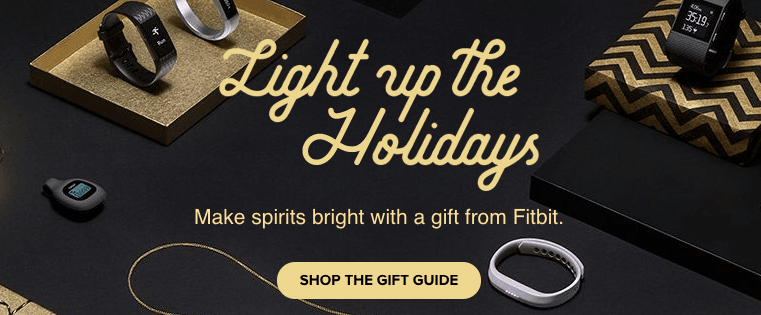
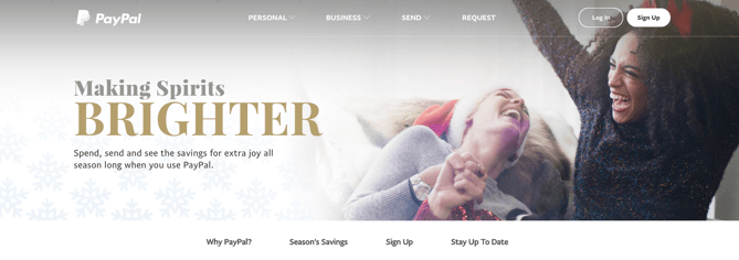
2) PayPal
Who ever said online money transfer websites can’t have fun at the holidays?
PayPal’s holiday homepage works because it still looks like PayPal — just a little more festive. It’s still easy to navigate but adds seasonal flair with a clever spin on a lyric from “Jingle Bells” as its holiday slogan. The whitespace encourages visitors to focus on the happy models in the image, putting human faces to an industry that’s businesslike and technical.
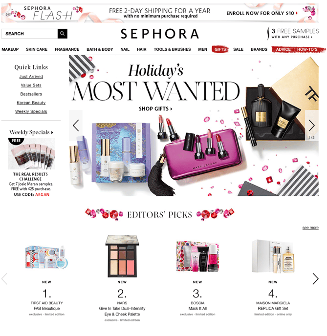
3) Sephora
Like PayPal, Sephora didn’t make many changes to the overall look and feel of its website. What it did do was feature a holiday edition of its highest-rated products and editors’ picks, specially curated for different gift recipients, price ranges, categories, and so on.
By putting editors’ picks front and center, Sephora is reminding customers how much the company values customers’ success. Plus, we love the sprinklings of gemstones throughout the page — it’s a cute, festive way to separate modules on the page.
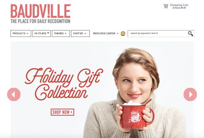
4) Baudville
While seasonal website redesign is often dominated by B2C companies, a few B2B businesses have been known to dress up websites a bit too. Baudville, an employee recognition solution, is one.
While some web designers like to add a ton of new elements to their holiday designs, Baudville shows you don’t have to. Something as simple as adding a holiday gift shop slide to your homepage photo banner can be enough to warmly welcome users to your site during this time of year.
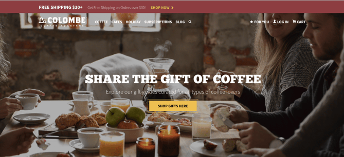
5) La Colombe
La Colombe’s holiday homepage design features soft, wintry hues and festive lighting. Visitors are greeted with high-definition photography of people enjoying La Colombe coffee products around a shared table. This webpage is another example of a business staying true-to-brand with an added holiday touch.
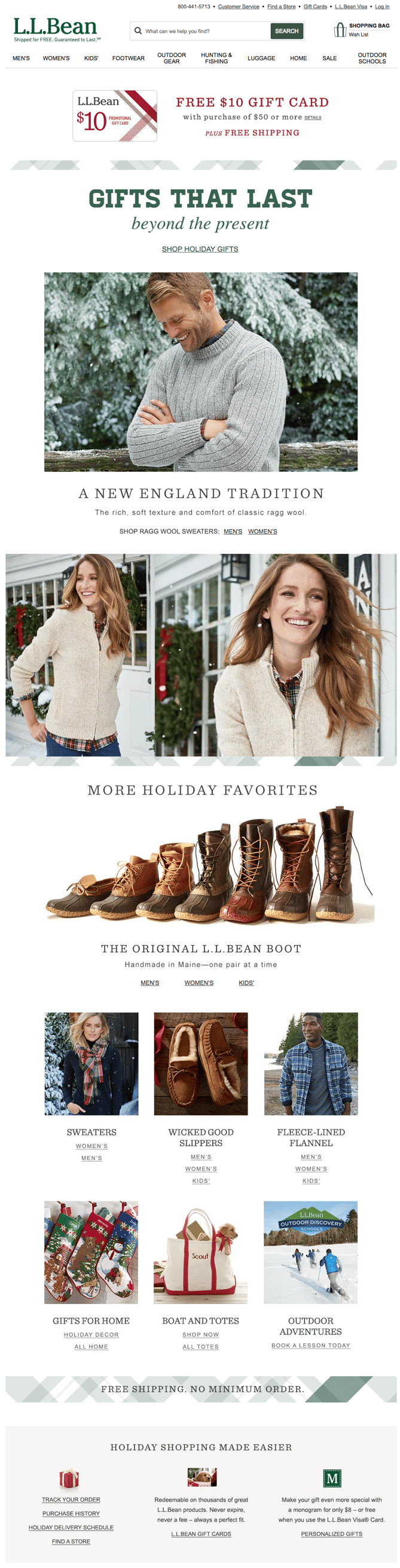
6) L.L. Bean
For a U.S. outdoor retail company like L.L. Bean, the holidays mean winter … which means cold. (For most of us, unfortunately.) It keeps the holidays out of the seasonal redesign completely: The featured photo on the homepage is a model wearing apparel in front of pine trees covered in show, which is in keeping with the brand’s outdoorsy theme.
L.L. Bean shares a list of holiday gift ideas featuring some of its most popular and beloved products. The seasonal homepage slogan — “Gifts That Last Beyond the Present” — reminds visitors of L.L. Bean’s amazing satisfaction guarantee.
If you’re more attracted to a winter-themed seasonal redesign, consider using winter-themed stock photos for your homepage. You might also consider cooling down the color scheme of your whole site for the holiday season. This means using cooler tones like blues, purples, and greens to give it a more “wintry” feel. (You can read more about cool color schemes in this blog post about color theory.)
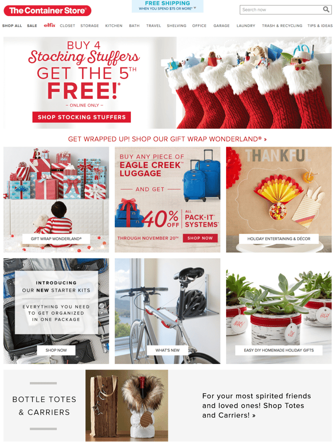
7) The Container Store
This homepage is a fantastic move for the holidays because it is chock-full of goodies for visitors. Every module on this homepage has something helpful to offer customers — stocking stuffers, gift ideas, luggage for holiday travel, party favors, and DIY projects.
The various CTAs on the homepage are clear and tell visitors everything they need to know about what’s on the rest of the site. The geometric shapes organize all of the content cleanly, so despite the fact that the homepage has several different offers on it, it’s not cluttered.
8) Xfinity
Between sporting events, holiday…
COMMENTS