
It’s time for a reminder that the strategic use of typography, color, and white space can drastically improve the efficacy and aesthetics of visual content. If you’re unfamiliar with the term, white or negative space refers to the unmarked spaces around or between visual elements in a design. Since the fundamental purpose of type is to communicate information, highly stylized, hard-to-read fonts should be used with caution. An easy way to create balance between readability and style is to use stylized fonts for large header text and keep body text more readable with minimal, traditional fonts. Use simple, high contrast color schemes to focus attention on elements of the design. Complementary color schemes feature two colors with highest possible contrast. When picking colors for your next project, keep in mind that strategically used high contrast color schemes create visual impact and highlight the most important information. Here are the three key design tips to keep in mind that will help you take your visual content to the next level: White space – Use the unmarked areas of the page to balance your design for a polished, professional look. Please note: All tools included in our blog posts are suggested by authors, not the CMI editorial team. Feel free to include additional tools in the comments (from your company or ones that you have used).

Given the power of visual content (it’s more memorable and more engaging than text-based content), many marketers have turned to DIY graphic design software or contracted with graphic artists.
With more traditionally text-focused people entering the world of visuals, it’s time for a brief refresher on the essential principles of design. It’s time for a reminder that the strategic use of typography, color, and white space can drastically improve the efficacy and aesthetics of visual content.
These three design tips will keep your blog, social media, and other visuals on the right track.
White space 101: Remove to improve
A telltale sign of an amateur designer is a shortage (or misuse) of white space. If you’re unfamiliar with the term, white or negative space refers to the unmarked spaces around or between visual elements in a design.
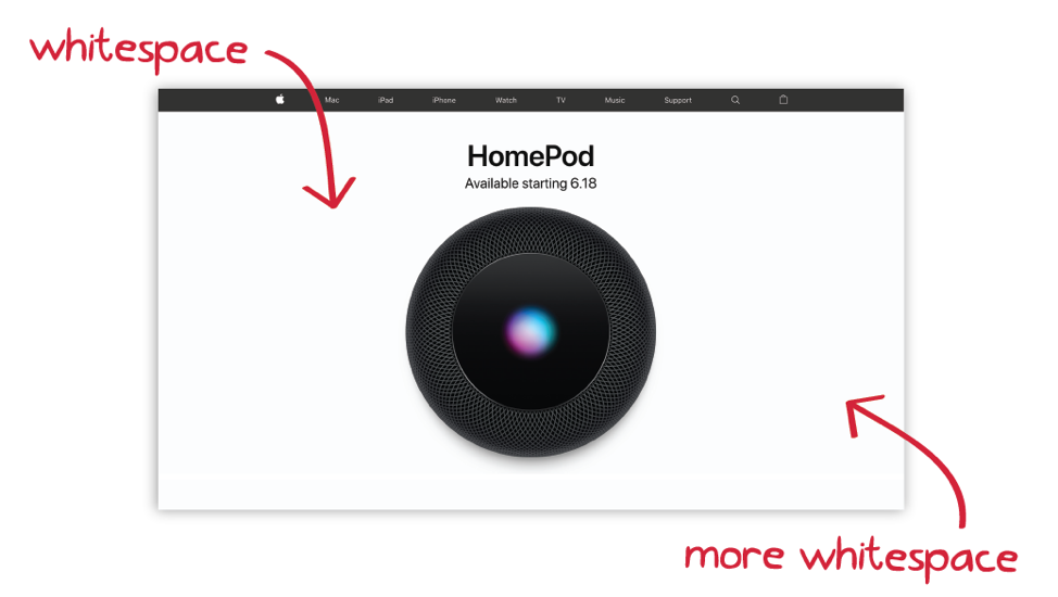
Apple’s use of white space for its HomePod page is extreme, but effective. The stark emptiness of the designs force viewers to focus on the product, which is often a work of art.
In contrast, non-designers often itch to fill every inch of space with text, images, or other design elements, leaving no place for the eye to rest.
To improve your designs, take a less-is-more approach. Remove elements that don’t clarify to give breathing room to the core elements. Use wider margins around the edges of the design and expand the space between unrelated elements to clarify page structure.

Leaving unmarked space in a design can immediately improve its visual appeal and ability to communicate. Always ask before you finish a design: Is there anything I can remove to improve this design?
Typography 101: Balance readability with style
Typography simply refers to the technique of positioning and styling type, but true typography aficionados say designing with type is both a science and an art. A lot of technical knowledge is required to master type design: the anatomy of letterforms; rules for kerning, tracking, and leading; type style classifications; etc.
As marketers and amateur designers, you can’t be expected to learn all these details. Instead follow this basic rule to up your typography game: Balance readability with style.
Every font brings something to the table in terms of both readability and style. Typically, the more stylized a font is, the harder it is to read. Since the fundamental purpose of type is to communicate information, highly stylized, hard-to-read fonts should be used with caution.

That doesn’t mean, however, that type must be boring. An easy way to create balance between…
COMMENTS