
It's called the PICA Protocol, and it's a visualization prescription for impactful data storytelling. So the answers to these questions are going to help you make an important decision, to choose an appropriate chart type for the message that you're trying to convey. Now, in this case, we have a categorical comparison, so I always go back to basics. Very often we'll use vertical bar charts for categorical comparison, but that will end up having diagonal labels if they're really long, and unless your audience walks around like this all the time, it's going to be confusing because that would be weird. In the case of bars, I always prefer to label each bar directly rather than relying on just an axis, because then their eyes aren't jumping from bar to axis to bar to axis and they're paying more attention to you. Then up here we'll put big letters saying this is sales, my keyword category. That's why I colored these particular bars, because this feels like the story to me, because that is the storytelling part of this message. What I have found that by using this protocol, you're going to end up with these wonderful, raving fans who are going to love your work and understand your value. I'd love to hear any questions you have about the methodology as well. About Lea-Pica — Lea Pica is an educator of thousands of digital analysts, marketers, SEM/SEOs, and consultants who want to present data stories that inform decisions, inspire ideas, galvanize into action, and communicate the value of their work.

If you find your presentations are often met with a lukewarm reception, it’s a sure sign it’s time for you to invest in your data storytelling. By following a few smart rules, a structured approach to data visualization could make all the difference in how stakeholders receive and act upon your insights. In this edition of Whiteboard Friday, we’re thrilled to welcome data viz expert Lea Pica to share her strategic methodology for creating highly effective charts.

Click on the whiteboard image above to open a high-resolution version in a new tab!
Video Transcription
Hello, Moz fans. Welcome to another edition of Whiteboard Friday. I’m here to talk to you this week about a very hot topic in the digital marketing space. So my name is Lea Pica, and I am a data storytelling trainer, coach, speaker, blogger, and podcaster at LeaPica.com.
I want to tell you a little story. So as 12 years I spent as a digital analyst and SEM, I used to present insights a lot, but nothing ever happened as a result of it. People fell asleep or never responded. No action was being taken. So I decided to figure out what was happening, and I learned all these great tricks for doing it.

What I learned in my journey is that effective data visualization communicates a story quickly, clearly, accurately, and ethically, and it had really four main goals — to inform decisions, to inspire action, to galvanize people, and most importantly to communicate the value of the work that you do.
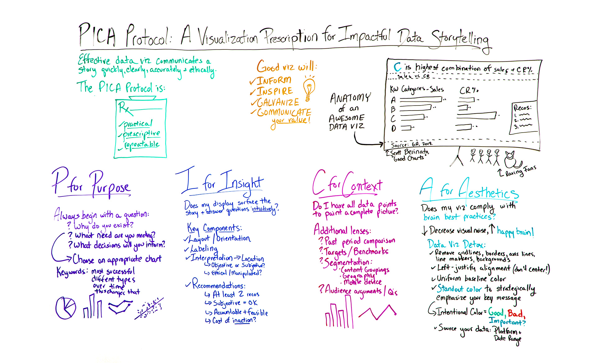
Now, there are lots of things you can do, but I was struggling to find one specific process that was going to help me get from what I was trying to communicate to getting people to act on it. So I developed my own methodology. It’s called the PICA Protocol, and it’s a visualization prescription for impactful data storytelling. What I like about this protocol is that it’s practical, approachable. It’s not complicated. It’s prescriptive, and it’s repeatable. I believe it’s going to get you where you need to go every time.

So let’s say one of your managers, clients, stakeholders is asking you for something like, “What are our most successful keyword groups?” Something delightfully vague like that. Now, before you jump into your data visualization platform and start dropping charts like it’s hot, I want you to take a step back and start with the first step in the process, which is P for purpose.
P for Purpose
So I found that every great data visualization started with a very focused question or questions.
- Why do you exist? Get philosophical with it.
- What need of my audience are you meeting?
These questions help you get really focused about what you’re going to present and avoid the sort of needle in a haystack approach to seeing what might stick.
So the answers to these questions are going to help you make an important decision, to choose an appropriate chart type for the message that you’re trying to convey. Some of the ways you want to do that — I hear you guys are like into keywords a little bit — you want to listen for the keywords of what people are asking you for. So in this case, we have “most successful.” Okay, that indicates a comparison. Different types or campaigns or groups, those are categories. So it sounds like what we’re going for is a categorical comparison. There are other kinds of keywords you can look for, like changing over time, how this affects that. Answers or opinions. All of those are going to help you determine your most appropriate visual.

Now, in this case, we have a categorical comparison, so I always go back to basics. It’s an oldie but goodie, but we’re going to do the tried-and-true bar chart. It’s universally understood and doesn’t have a learning curve. What I would not recommend are pie charts. No, no, no. Unless you only have two segments in your visual and one is unmistakably larger than the other, pie charts are not your best choice for communicating categorical comparison, composition, or ranking.
I for Insight
So we have our choice. We’re now going to move on to the next step in the methodology, which is I for insight. So an insight is something that gives a person a capacity to understand something quickly, accurately, and intuitively. Think of those criteria.
So here, does my display surface the story and answer these questions intuitively? That’s our criteria. The components of that are:
- Layout and orientation. So how is the chart configured?…
COMMENTS