
The length of the form field combined with the prominent placement eliminates nearly all friction to create an account ... but if you're having doubts, you can always scroll below to read answers to top FAQs. Although there are lots of amazing things about this landing page, the two that I absolutely love are: 1) The use of a chat window instead of a classic form, and 2) the detailed -- but well packaged -- information below the form. Below this simple form field is a bright orange button that contrasts well with the hero image behind the form, and emphasizes that the estimate will be personalized to your home. An animal cartoon appears beside each informational section of the landing page, keeping visitors scrolling down to learn more. The rest of the page offers detailed information about what you'll get when you give over your information. Aside from its beauty, the page has some great conversions elements: an above-the-fold form, clear and concise description of what'll happen when you fill out the form, and even the bright orange "Submit" button. While I wouldn't typically include an example of a homepage with a form on it in a post about landing pages, this website is special. Here's what it looks like before you click: And, when you click that CTA, check out how the form appears: I love how you don't have to leave the page to fill out the form, yet the form won't feel intrusive to casual website visitors. Keep in mind that a lot of visitors will be accessing your landing pages on their smartphones or tablets, and if the design of your website doesn't work well for them, they might give up and leave your page. There are only a few fields you need to fill out before you get started.

How do you convince your visitors to take the plunge on your website?
There are so many elements that a top-notch landing page needs, and making those elements the “best” they can be often depends on what your landing page goals are.
Take form length, for example. It’s just one of the many components you need to optimize, but best practices will tell you that both short and long forms perform well — it all depends on whether you want to generate a lot of (potentially) lower quality form submissions, or a smaller number of higher quality submissions.So if you’re looking to up your landing page game, it’s helpful to know what goes into a great landing page and see a few examples of these nuanced elements in action. Surprisingly, when I started doing research into the latter, I realized there are hardly any sites out there with examples of modern, impressive landing pages that are more than just a sign-up form on a homepage. So we decided to compile a list of landing pages we love ourselves.
Big, big caveat here: I don’t have access to any of the stats for these pages, so I can’t tell you how well they convert visitors, leads, and customers. Still, these examples have some of the best combinations of those nuanced landing page elements I’ve ever seen. Obviously, if you feel inspired to try any of these tactics on your own site, the only way to know whether they’ll work for you for sure is by testing them out for yourself.
16 Examples of Great Landing Page Design
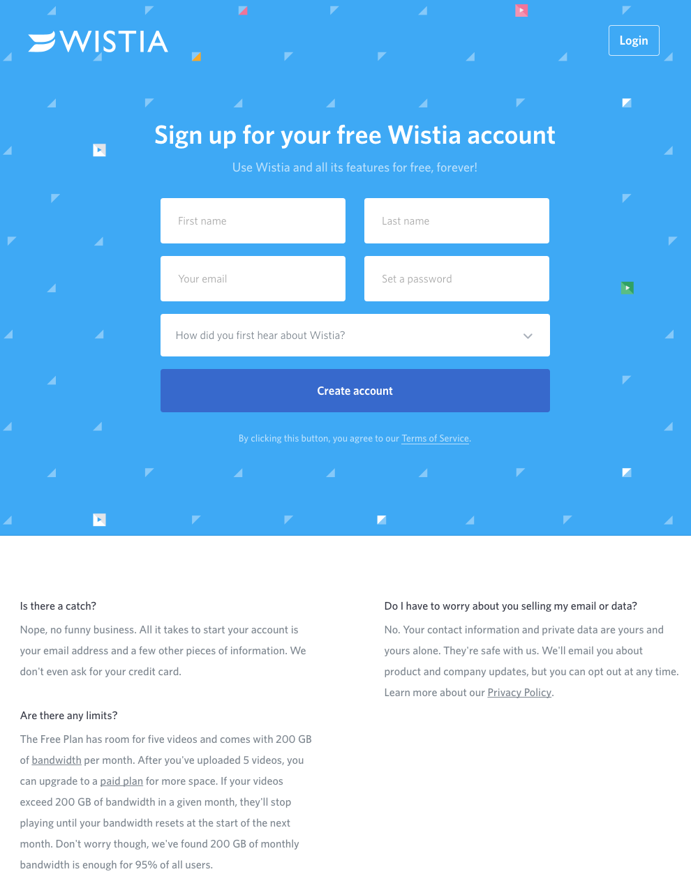
1) Wistia
First up is Wistia’s landing page for their Free Wistia Account. Right off the bat, you notice the one-field form to create your account — the blue, minimally patterned background contrasts nicely with the bright white form field.
The length of the form field combined with the prominent placement eliminates nearly all friction to create an account … but if you’re having doubts, you can always scroll below to read answers to top FAQs. By separating these two sections with stark color contrast, Wistia makes it much easier for you focus on converting.
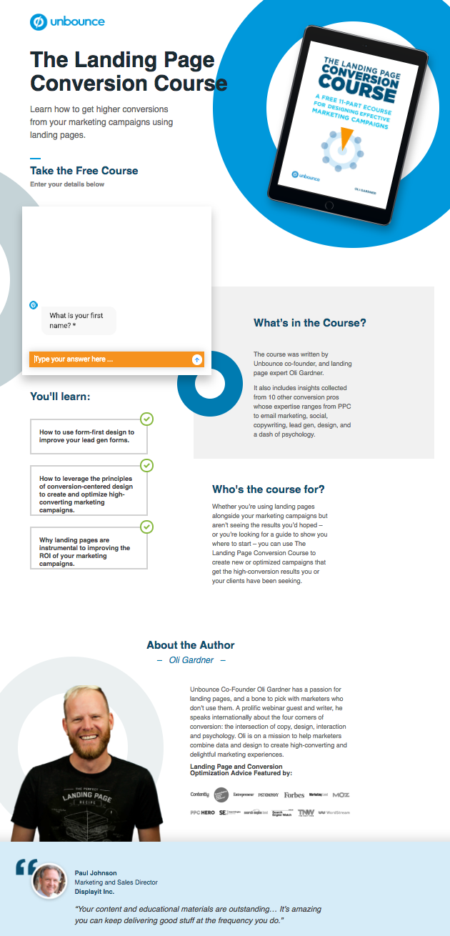
It’s no surprise Unbounce is near the top of this list — they’ve actually written the book on creating high-converting landing pages. Although there are lots of amazing things about this landing page, the two that I absolutely love are: 1) The use of a chat window instead of a classic form, and 2) the detailed — but well packaged — information below the form.
The first helps direct attention to the goal of the page — for you to fill out the form — in a way that’s unobtrusive and feels less like a chore. The second gives this page an SEO boost (search engines will have more content to crawl) and assuages any worry from folks who need to know more about a piece of content before handing over their information, all while not distracting people from the chat window.
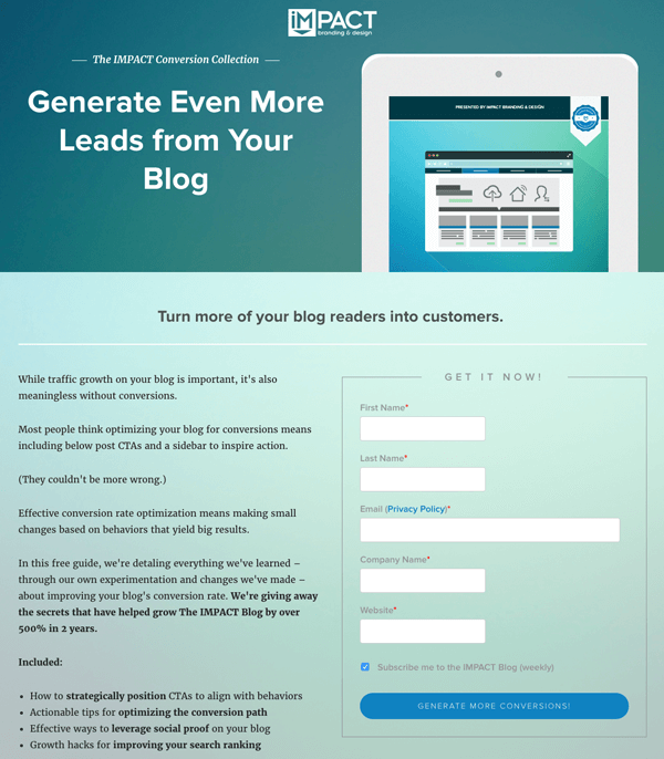
Full disclosure: IMPACT is a HubSpot partner — but that’s not why they’re included here. IMPACT’s landing pages have long been a source of design inspiration. I love the simple layout of the page, from the large headline copy and detailed featured image, to the outline that surrounds the form, to the colors and fonts that are very pleasing to the eye.
Notice that they’ve included a check box to subscribe to their blog, which is automatically checked. Note that while adding a check box field to your landing page forms is a great way to increase subscribers, it’s better to leave it unchecked and let users opt in. Otherwise, you’ll risk adding a lot of low quality subscribers to your contact base.
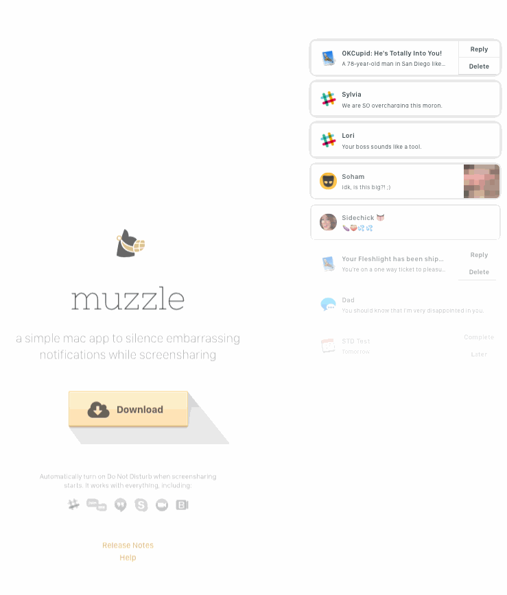
Landing pages help users decide whether or not your product or service is actually worth their precious time and energy. What better way to clearly and straightforwardly communicate your value proposition than by confronting visitors with the very problem your app solves?
Muzzle, a mac app that silences on-screen notifications, fully embraces this show don’t tell mentality on their otherwise minimal landing page. Visitors to the page are greeted with a rapid-fire onslaught of embarassing notifications in the upper left of the screen. Not only is the animation hilarious, it also manages to compellingly convey the app’s usefulness without lengthly descriptions.
Often, people think landing pages are static pages on your website. But with the right tools, you can make them interactive and personalized.
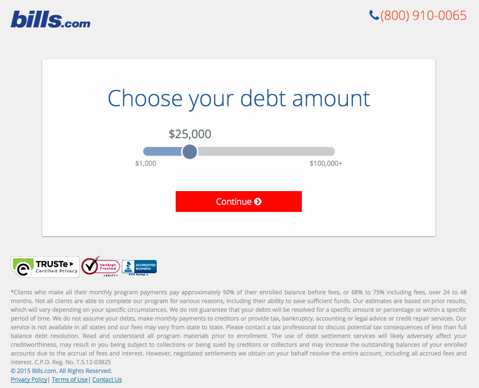
Take the example below from Bills.com. To see if you’d benefit from their consultation, you answer three questions before you are shown a form. It starts with this one:
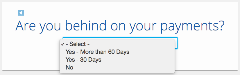
Then, you answer two more questions, like the one below:
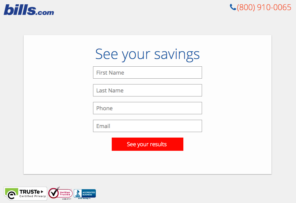
And here’s the final landing page form where you fill out your information:
I’m not sure how the algorithm works (or…
COMMENTS