
However, minimalist isn't as simple as white space. Heather Shaw ensures true simplicity in her Ocean Conservancy book, which grabs the reader's attention with minimal text and colors. Stefanie Brückler uses contrasting colors and clean font to ensure the cards can do their jobs without seeming unoriginal. Minimalist Web Design Huge Inc.'s homepage is clean and polished, with minimal text to ensure a new viewer doesn't feel overwhelmed by the page. Additionally, the small details -- like the black that appears in the logo as well as the second half of realtor.com, and the small jagged line in the bottom right corner -- signify a sense of cohesiveness. Additionally, the small white logo serves to reinforce their main point. Brack's use of white space and overlapping elements serves to create a clean and inviting homepage. Additionally, the small white font looks simple and clean against the photo background. Minimalist Poster Design Miselu's graphic design undoubtedly supports the notion that less is more. Ultimately, these posters, along with their other designs, reinforce their core products while remaining simple enough to be adaptable as their brand changes over time.

Whether you’re curating an Instagram feed or designing a web page, there are plenty of advantages to minimalist design.
Rather than bogging your audience down with vibrant patterns or paragraphs of text, a minimalist approach allows you to focus on a few key components of your brand you feel are truly important.
However, minimalist isn’t as simple as white space. To avoid creating boring or uninspiring designs in your attempt to become minimalist, it’s critical you take a look at some successful examples of minimal design, ranging from posters to logos, to kickstart your creative process.
Minimalist Graphic Design
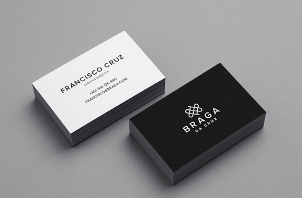
These Braga Da Cruz jewelry store business cards, designed by Luke Halota, are a good example of how minimalism can help brand name stand out on the page. Halota uses grids to center the company name on one side, with a small, unobtrusive logo placed above. On the back, he makes sure to use simple white space to make Francisco Cruz the focal point.

Minimalism doesn’t have to be boring. Here, Visme created a pop-up ad where the primary focus remains on the “Join us!” blue button, which contrasts nicely against the orange background. Additionally, to grab the viewer’s attention, Visme placed a large lion’s head image on the left side of the ad.
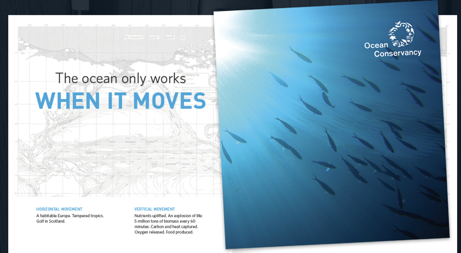
Heather Shaw ensures true simplicity in her Ocean Conservancy book, which grabs the reader’s attention with minimal text and colors. The information is plainly outlined and easy-to-follow. Additionally, there’s a lightly outlined sketch of an ocean behind the text — while not overbearing, it adds texture to the design.
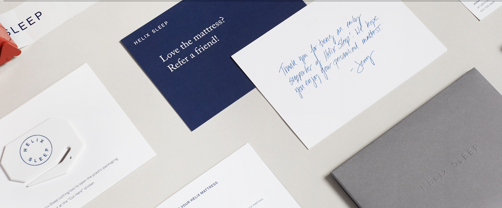
These Helix Sleep referral cards look both sleek and helpful. Stefanie Brückler uses contrasting colors and clean font to ensure the cards can do their jobs without seeming unoriginal.
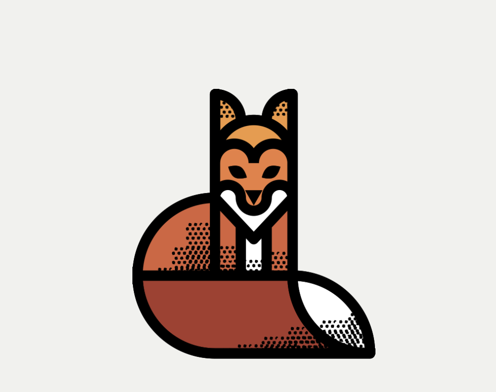
On his page, Komierowski explains, “I was asked by Pixite to create a set of nature-inspired shapes for their app Fragment.” Ultimately, his design is aesthetically-pleasing and fun, with simple, cohesive lines that form the shape of a fox.

One of the most iconic minimalist designs, Mastercard’s financial design is undoubtedly a staple of the brand. The simple red and orange circles signify connectedness and seamlessness. The circles are recognizable enough that Mastercard can use the icon in place of any brand text, and still convey its ownership.
Minimalist Web Design
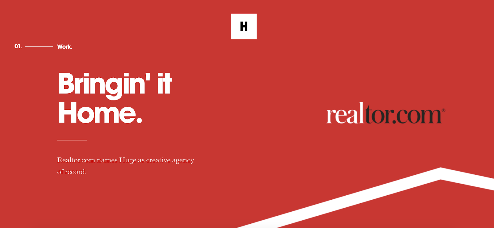
Huge Inc.’s homepage is clean and polished, with minimal text to ensure a new viewer doesn’t feel overwhelmed by the page. Additionally, the small details — like the black that appears in the logo as well as the second half of realtor.com, and the small jagged line in the bottom right corner — signify a sense of cohesiveness.
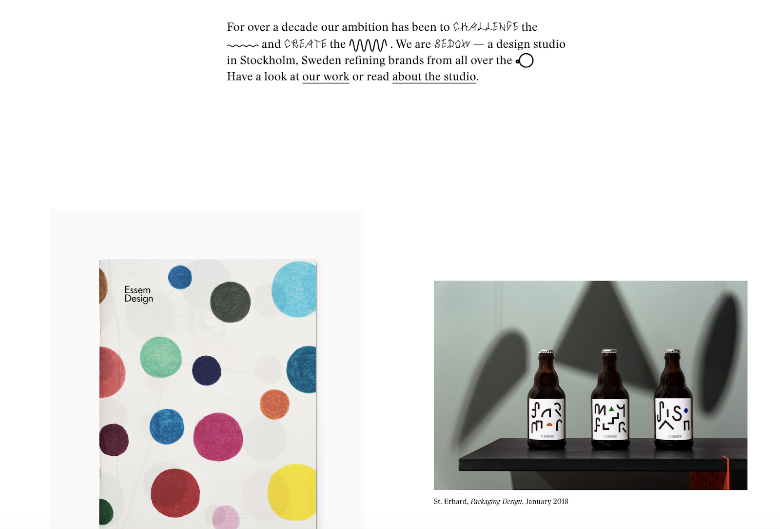
Bedow, a Stockholm-based design studio, knows its viewers priorities, and thus doesn’t waste time…
COMMENTS