I’ve also heard other people say that it doesn’t really matter because most people are willing to scroll. Take a look at the homepage of any major company, and I can pretty much guarantee they’ve included their brand logo above the fold. Here’s HubSpot’s homepage: And here’s Dropbox’s homepage: Simple navigation Let’s say a visitor has just landed on your homepage for the first time. Allow me to provide you with a few examples of brands that do this really well. It’s not necessary for every website, but it’s a great way for some sites to give first-timers a quick and easy way to get acquainted with the site, providing them with the best content to accomplish that. Notice that all three of these examples feature simple, easy-to-spot navigation. This is crucial for encouraging visitors to browse your site in-depth and for getting conversions. I mean, why would you not include a CTA above the fold? Here’s a recap: A well-written USP Some brief explainer copy Your branded logo Simple, intuitive navigation Contact info – especially important if you’re running an e-commerce store The CTA is optional and doesn’t typically affect conversion rates as much as you may think. What do you think the most important element to include above the fold on your homepage is?
The majority of people have the attention span shorter than a goldfish.
When it comes to your website, it’s probably hurting you.
According to HubSpot, “55% of visitors spend fewer than 15 seconds on your website.”
You’d better grab their attention in a hurry.
But how do you do that?
By placing the most important information above the fold.

And it’s one that has received a lot of debate.
I’ve heard some people say you need to follow the original formula religiously and keep key information above the fold.
I’ve also heard other people say that it doesn’t really matter because most people are willing to scroll.
And this makes more sense as of late, considering the number of people using mobile devices.
Everyone has their own opinion, and that’s okay.
But in this post, I’ll share my take on what needs to be above the fold on your homepage.
I’m going to cover the key elements and absolute essentials and condense them into a comprehensive list so you’ll know precisely what to include.
What exactly does “above the fold” mean?
Before I dive in, allow me to give you a formal definition of “above the fold” so that we’re on the same page.
According to Tech Target,
above the fold is the portion of a web page that is visible in a browser window when the page first loads.
In others words, it’s what visitors first see without scrolling.
Although we usually think of websites when referencing “above the fold,” this term actually originated with traditional print publications.
It was simply the upper half of the front page of a newspaper where the top story was printed.
Like this:

Why is above the fold so important?
It’s simple.
- It’s what people see first.
- It’s what attracts the most attention.
- It’s where visitors spend the bulk of their time.
A 2011 eyetracking study from Jakob Nielsen found that visitors spend 80% of their time above the fold.

It’s easy to see why people make such a big fuss about deciding what to include above the fold.
While there will always be some debate as to how important placing content above the fold is, there’s no denying that it is important.
And the way I see it, there are a handful of vital elements that need to be included.
Unique selling proposition (USP)
Here’s a screenshot of the definition of a USP from Tech Target:

Your USP is the way visitors get their bearings after landing on your site.
It’s your way of instantly showing them what you’re offering and how they’ll benefit by exploring your website further.
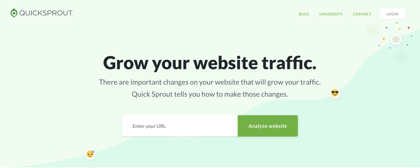
Here’s the USP for Quick Sprout:

It doesn’t matter what industry you’re part of or what niche you specialize in, a clear, well-crafted USP is a vital element of your above-the-fold content.
Some “explainer” copy
So, your USP provides visitors with an initial orientation.
But it doesn’t usually explain all the details.
This is why you need to include a bit of “explainer” copy that tells first-timers what your product does.
Here’s a great example from the Ahrefs homepage:

It’s brief and concise, but visitors can quickly tell what they can accomplish by using Ahrefs.
In this case, they can learn what’s helping competitors rank high and what steps they can take to outrank them.
Notice that it doesn’t drone on paragraph after paragraph with long-winded copy.
It matter-of-factly…

COMMENTS