This eagerness to predict elections was carried into the 21st century by FiveThirtyEight founder Nate Silver, who accurately predicted 49 out of 50 states during Obama’s first presidential bid. If you trace these predictions, from the Tribune’s cholera chart to the mass of reports from this election season, we see how people have been interested in figuring out innovative ways to present data for well over a century. My team at Fractl recently spoke with reporters and strategists to learn more about how they produce data-driven content, where they find inspiration, and what they expect from the future of data journalism. Letting data tell the story “When we take on these sorts of projects, we put the story first rather than the technology,” said Nathaniel Lash, a data reporter for the Tampa Bay Times. Last year Lash used data journalism to take a closer look at the failure of a Florida school district. Then they crisscrossed the state to see how other school districts compared.” This massive amount of data was interesting, but unique visuals ultimately turned it into a noteworthy piece of work. The New York Times and The Guardian are two high-profile publishers, in particular, that have taken the popularity of data journalism and cemented it in their newsrooms. One such project, PANDA, equips newsrooms with a set of web-based tools that make it easier for journalists to craft data-driven stories. Think back to the Tampa Bay Times’ series on failing schools in one region. Although this might seem counterintuitive, some of the best visualizations are just that—great visuals.
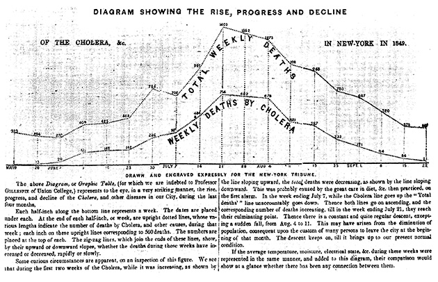
In the 19th century, the streets of New York City proved to be the perfect incubator for cholera. The disease made its debut during the summer of 1832, when 3,000 New Yorkers died within a few weeks. By 1849, more than 5,000 deaths could be traced back to cholera, becoming a full-blown epidemic.
To show when the disease was most rampant that year, the New York Tribune published a chart that compared weekly cholera deaths to total weekly deaths. This comparison helped readers see that while total deaths declined during the last week of June 1849, cholera deaths actually began to rise—a visual representation that hinted at the outbreak’s peak, which came a few weeks later.
By the 20th century, there was a noticeable shift in the way publishers used data. Instead of just plotting trends, individuals also collected data to make predictions. For example, in 1952, Navy mathematician Grace Murray Hopper and a team of programmers used voting statistics from earlier elections to predict Eisenhower’s win within one percentage point. This eagerness to predict elections was carried into the 21st century by FiveThirtyEight founder Nate Silver, who accurately predicted 49 out of 50 states during Obama’s first presidential bid. (Although Silver didn’t fair as well during the most recent election.)
If you trace these predictions, from the Tribune’s cholera chart to the mass of reports from this election season, we see how people have been interested in figuring out innovative ways to present data for well over a century. We’ve always wanted the who, what, where, and when, but audiences are very interested in the why. They want to see the context behind a particular moment and how it fits into a bigger picture.
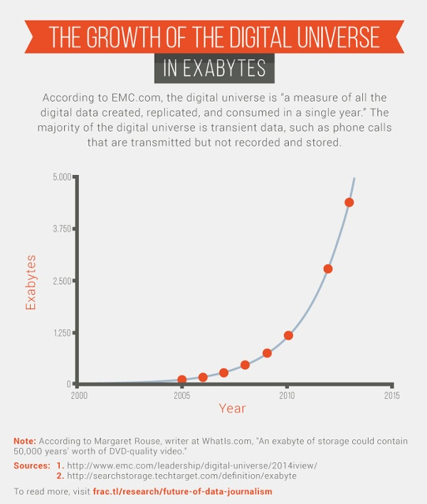
Luckily, there are plenty of opportunities to turn data into stories. Since 2005, the size of the digital universe (defined as all of the digital information that is created, replicated, and consumed in a single year) has grown by a factor of 33.
So what does this all mean in terms of successful content?
My team at Fractl recently spoke with reporters and strategists to learn more about how they produce data-driven content, where they find inspiration, and what they expect from the future of data journalism.
Letting data tell the story
“When we take on these sorts of projects, we put the story first rather than the technology,” said Nathaniel Lash, a data reporter for the Tampa Bay Times. Last year Lash used data journalism to take a closer look at the failure of a Florida school district.
In December 2007, the Pinellas County School Board resegregated its public schools, justifying its decision with the promise that schools in poorer neighborhoods would get more resources than those in more affluent areas. While collaborating with several reporters, Lash helped produce “Failure Factories,” a five-part series that synthesized more than five years of disastrous consequences into an engaging story.
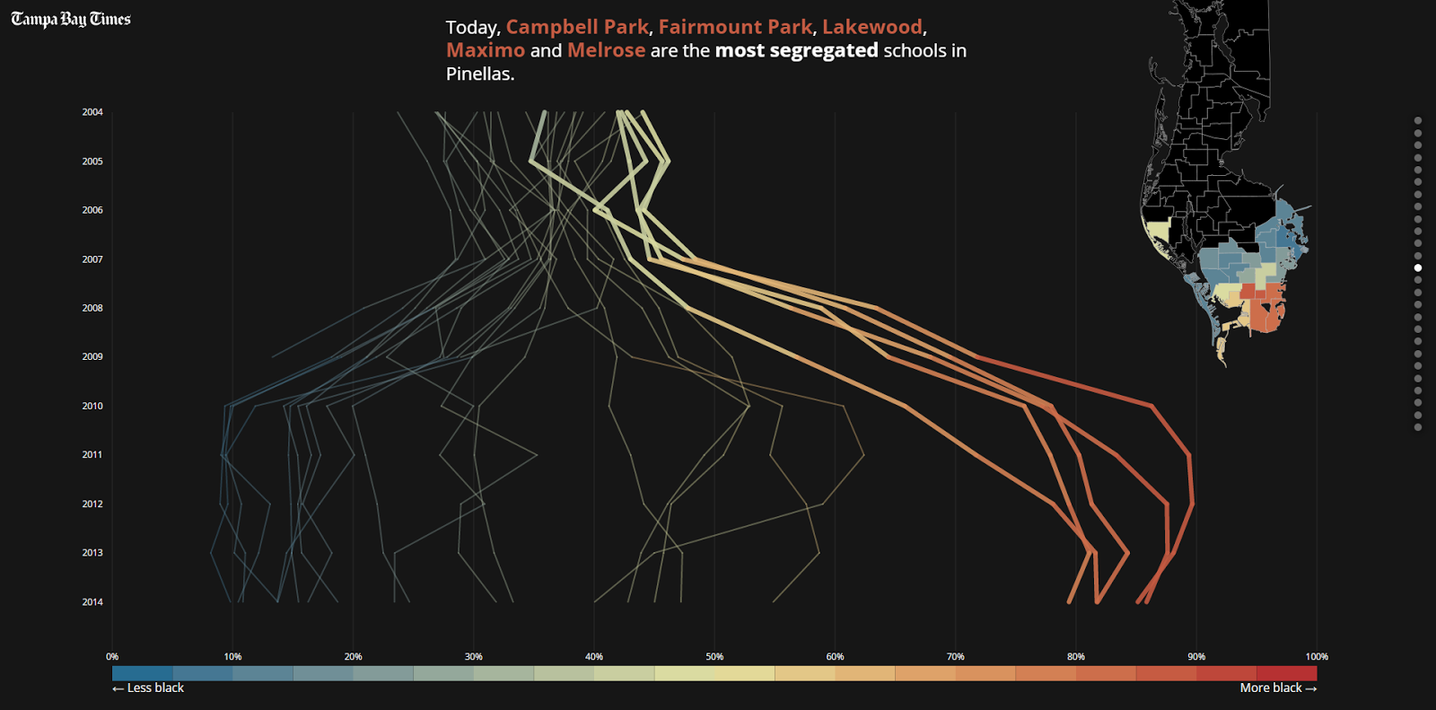
The project used an astronomical amount of data. As the first installment in the series pointed out, “Times reporters spent a year reviewing tens of thousands of pages of district documents, analyzing millions of computer records and interviewing parents of more than 100 current and former students. Then they crisscrossed the state to see how other school districts compared.”
This massive amount of data was interesting, but unique visuals ultimately turned it into a noteworthy piece of work. The story nailed this concept from the very beginning with a prologue that focused on presenting tough facts—more than 80 percent of black elementary school students in Pinellas County, for…
COMMENTS