.jpg?t=1483016194828&width=381&name=ThinkstockPhotos-519749523-compressor%20(1).jpg)
What makes people want to share an infographic?
Is it a certain color scheme that catches the eye? Do certain formats work better than others? Or, in the end, is it all about the content? At Visme, we set out to answer these questions by performing a content analysis of the most shared infographics on social media.
Using BuzzSumo, we identified every infographic with more than 5,000 shares across some major social media platforms — Facebook, Pinterest, Twitter, LinkedIn, and Google+ — and analyzed them for different characteristics. Those were things like word count, size, colors used, format, and topic.
Here’s what we found after analyzing over 200 infographics — and takeaways on how you can apply these insights to your own infographics, making them more shareable.
10 Factors Behind the Most Popular Infographics of 2016
1) Most Popular Industries
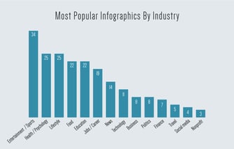
Infographics were once used to simplify complex topics with the sole purpose of educating the viewer. Now, they’re seen as a highly shareable content format, with the same viral potential as memes — after all, visual content is 40X more likely to get shared on social media.
That could explain why we found that most of the past year’s top-shared infographics were in categories like entertainment, sports, health, psychology, lifestyle, and food. And from the evolution of Justin Bieber’s music, to a visual of Kobe Bryant’s career highlights, the most shared infographics of 2016 also had celebrities as their central focus.
Many of the most popular infographics were also focused on topics personally relevant to readers’ lives, like health and lifestyle tips — which contrasts from content on politics, global causes, or news.
Takeaways for Marketers
Focus on creating infographics that directly appeal to readers’ personal needs and goals. Creating a buyer persona can help, as it helps you to understand what those goals are.
2) Most Popular Industries by Social Network
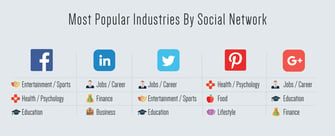
Certain topics perform better on different social networks. As the site with the most users, for example, Facebook seems to be the place to post content related to entertainment, sports, health, psychology, and education. Meanwhile, infographics with career-related content do best on LinkedIn, where you’re also most likely to find infographics on finance and business topics.
On Pinterest, content related to health, psychology, food and lifestyle perform best. Roughly 31% of online adults use this social network — compared to 72% for Facebook — with the majority of users being women.
Twitter, conversely, appears to be the place to post content related to jobs, entertainment, sports, and education. With 23% of online adults using it, it’s comparatively lagging among other social networks.
Takeaways for Marketers
When you’re developing your buyer personas, figure out where they “live” online. Combined with their interests and goals, that will help you determine where they’re most likely to discover your visual content.
3) Most Popular Infographics by Type
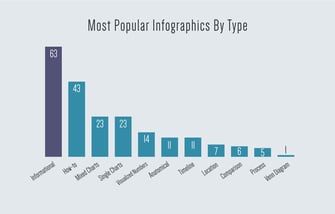
Not all infographics are created equal. From timelines, to maps, to charts, to the occasional article that’s converted into an infographic — No one of these visuals is identical to another.
And while some might argue that the last format — the article-as-an-infographic — isn’t really an infographic since it contains no numbers, we found it to be the most popular one. They don’t actually include any statistics, charts, or visualizations. Rather, they contain existing informational content enhanced by colors, icons, and other illustrations.
The second-most popular type in this sample was the how-to infographic, which guides readers through steps to achieve a certain outcome. Within this category are “cheat sheets” — the infographics that compile all the information readers need to complete a particular task, within a single graphic. Think: keyboard shortcuts for Mac, or baking and cooking substitutions.
For the sake of comparison, here are some additional formats that were included in our sample:
- Mixed charts: Uses a variety of charts and graphs
- Single charts: Displays one chart or graph
- Visualized numbers: Uses icons, colors, and other graphical elements to visualize stats and figures
- Anatomical: Visualizes the parts of a whole
- Timeline: Visualizes a chronological sequence of events
- Location: Visualizes a geographical location through a map
- Comparison: Compares more than one thing or idea, side-by-side
- Process: Uses a flowchart or decision tree
Takeaways for Marketers
For the most part — and to our surprise — infographics with the least amount of statistics and numbers performed best on social media. The one exception to that rule is a visual cheat sheet, which serves…
COMMENTS