![5 Infographics to Teach You How to Easily Make Infographics in PowerPoint [Free Templates]](http://www.marketinghub.today/wp-content/uploads/2018/12/5-infographics-to-teach-you-how-to-easily-make-infographics-in-powerpoint-free-templates.png "5 Infographics to Teach You How to Easily Make Infographics in PowerPoint [Free Templates]")
That's right -- PowerPoint can be your best friend when it comes to visual content creation. And in this post, we'll highlight five of the infographic templates from the download and teach you some PowerPoint infographic creation basics along the way. 5 Infographics That Teach You How to Create an Infographic in PowerPoint 1. Before we describe how to create a timeline via our timeline infographic template, find out below how to design a timeline from scratch using PowerPoint. How to Make a Timeline in PowerPoint Select "SmartArt" from the PowerPoint navigation bar. Insert your data into the graphic. There are two categories of graphics that make effective timelines. Insert your data into the graphic. Just select "Insert" > "Chart ..." and you'll have several options to choose from. Save Save To make sure your end result is as hip as possible, here are some design tips to follow: Experiment with new color palettes.
Despite the spattering of headlines that have popped up over the past several years proclaiming “infographics are dead,” infographics are, in fact, alive and well.
Infographics aren’t just alive and well — they remain a staple in many business’s content strategies. And while there are a lot of them, marketers who spend the time aligning the topic, content, and style of their infographics with the needs and preferences of their target audiences are still finding success among their audience.(And by “success” I mean driving traffic — and potential leads — to their websites and generating social buzz through people sharing and commenting.)
As of 2018, the use of infographics among B2B marketers has increased the most of any marketer in the last four years, now at 65%. And according to John Medina, a developmental biology expert, adding an image to written content can increase one’s ability to retain that information by 55% (wow).
But how can those who don’t necessarily have a design background — or the budget to commission an agency, hire a dedicated in-house designer, or purchase expensive design software — create professional-looking infographics that are able to captivate their audiences?
Here’s a little secret: You can do it using the software you probably already have installed on your computer. That’s right — PowerPoint can be your best friend when it comes to visual content creation.
To help you get started, we’ve created 10 fabulous infographic templates you can download and use for free right within PowerPoint. Don’t be shy … download them here.
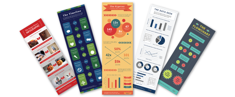
And in this post, we’ll highlight five of the infographic templates from the download and teach you some PowerPoint infographic creation basics along the way. Just be sure to download the PowerPoint templates for yourself so you can easily customize the designs you see below!
5 Infographics That Teach You How to Create an Infographic in PowerPoint
1. How to Create an Infographic Filled With Data
Infographics and data visualization are the peanut butter and jelly of the visual content world.
When you have new data to reveal to the world, you can use an infographic to display that data as part of a cohesive, visual narrative. And that’s exactly what the “Data Geek” template is for.
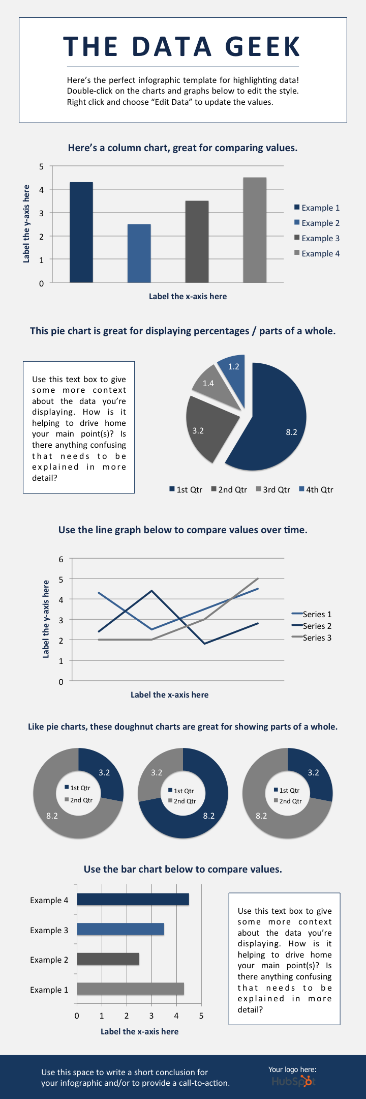
We’ve loaded this template with a variety of different charts and graphs, which you can easily update with your own data. (Just right click on a graph, choose “Edit Data,” and you’ll be able to customize the values in an Excel spreadsheet.)
Not sure which types of graphs to use for your different data sets? Here are some best practices to keep in mind:
- Column chart: Use for comparing different categories or for showing changes over time (from left to right).
- Pie chart: Use for making part-to-whole comparisons. (Note: They work best with small data sets.)
- Line graph: Use for showing data that changes continuously over time. Ideal for displaying volatility, trends, acceleration, or deceleration.
- Doughnut chart: Use like a pie chart. This stylistic variation allows you to put a number, graphic, or other visual in the center of the chart.
- Bar chart: Use like a column chart. (The horizontal bars make it easier to display long category names.)
2. How to Make a Timeline Infographic
Telling the history of a particular industry, product, brand, trend, or tactic can be a great topic for an infographic. And while there are a variety of different ways that you can visualize time — including in a circle, which is what we did with our Google algorithm updates infographic — the timeline is by far the most common and easiest design method to use.
Before we describe how to create a timeline via our timeline infographic template, find out below how to design a timeline from scratch using PowerPoint.
How to Make a Timeline in PowerPoint
- Select “SmartArt” from the PowerPoint navigation bar.
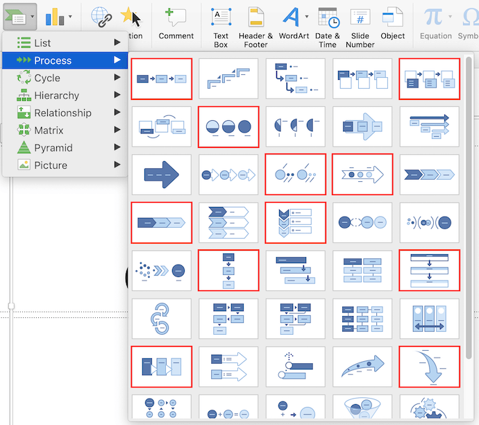
- Find a graphic that fits your data from the Process menu.
- Or, select “Alternating Picture Circles” from the Picture menu.
- Add or remove timestamps from your timeline graphic.
- Insert your data into the graphic.
- Edit the text and imagery of your SmartArt graphic.
To make a timeline graphic in PowerPoint, suitable for any infographic, open PowerPoint and click “Insert” from the top navigation bar, as shown below. Then, select the SmartArt icon beneath the navigation bar, where you’ll find several categories of graphics to choose from.
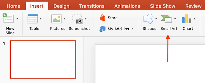
There are two categories of graphics that make effective timelines. The first is the Process category. Click this option to expand the graphics menu shown below. To make your selection easier, we’ve highlighted in red a few of the most fitting timeline-related graphics.
3. Or, select “Alternating Picture Circles” from the Picture menu.
Aside from the Process menu of graphics, you’ll also find a viable timeline graphic in the Picture category. Select this category and you’ll find the “Alternating Picture Circles” option near the center…
COMMENTS