
7 Principles to Creating Great Infographics. In fact, these principles are relevant not only to infographics but any content you create. Your next step is to identify or discover topics and stories from those answers. With infographics, content typically formatted as a how-to guide follows this principle. Now, aren’t you curious about the story behind this proverb, and perhaps the stories behind other common phrases that we know and use? Our curiosity and determination to find meaning are what make origin stories so popular. One example might be to identify the average time people spend on Facebook. You survey customers and identify that dogs consume an average of 2.5 treats a day. Looking at this map, it’s shocking to see how little so many millennials are making. Create one that follows the principles of great content, and it will be seen.

Sure, you can pretty much create an infographic for any blog post, but that doesn’t mean it will perform spectacularly. Creating a great infographic requires a great idea first and foremost.
In this guide, I break down the ideation process so that coming up with more memorable infographic ideas doesn’t have to be so hard. In fact, these principles are relevant not only to infographics but any content you create.
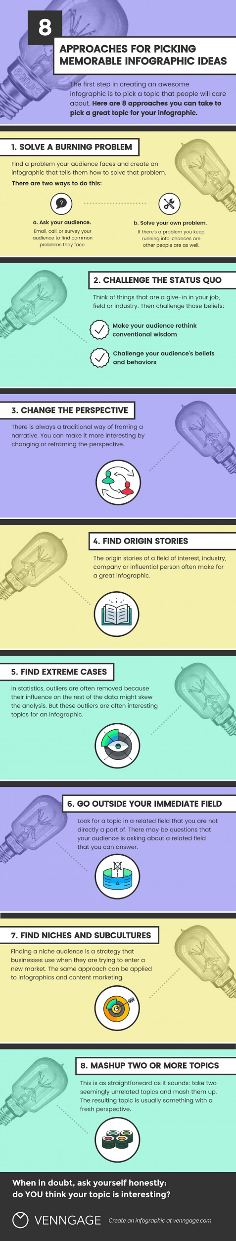
1. Solve a burning problem
When it comes to producing high value content – shareable and link-worthy – create an infographic that solves a burning problem.
This approach requires you to first think about the problem that you’re trying to solve or the questions you’re trying to answer with your infographic story. This usually requires you to put yourself in your readers’ shoes.
First, ask yourself: What are the problems my audience is facing?
Your next step is to identify or discover topics and stories from those answers.
For instance, why do you think AMAs on Reddit and Inbound.org are so popular? It gives normal people the opportunity to ask questions of those who may be more successful than them – questions they believe will lead to their own eventual success.
With infographics, content typically formatted as a how-to guide follows this principle. One example is this one by Silver Door on how to successfully manage a team while working remotely – a burning and growing problem as remote teams become more common.

The data is presented in a simple and easily digestible format, offering a solution to a pain point.
As you attempt to provide solutions to burning problems, identify the data or the information you possess that your audience wants or needs, and present it in a way which provides value but also positions you as a leader in the industry.
2. Challenge the status quo
Next, creating content that challenges the status quo is a great way to position you and your company as experts and influencers in a certain area.
Consider this example from our study (and infographic) where we looked at nearly 200,000 tweets using hashtags. We made the statement that hashtags are useless. This challenges the typical assumption that they actually provide value in marketing.

Much like the myth-busting principle, creating content that challenges the status quo is sure to cause some controversy and debate. But these types of pieces tend to get the conversation going, thus making more people aware of your brand.
3. Change the perspective
The next principle is to reframe the question or alter the perspective. The best way to describe this principle is by looking at an example from the Bill and Melinda Gates Foundation.
The organization wanted people to understand the importance of malaria vaccinations. Instead of simply presenting the facts and listing the impact – the death toll caused by malaria – the foundation created an infographic about the world’s deadliest animals.

When you see that nearly 1 million people die every year from mosquito bites, and only 10 deaths are caused by shark attacks, the data becomes much more surprising and memorable.
By offering a comparison, and presenting the question in a different way, the foundation made the idea that a malaria vaccination is a simple way to avoid death so much stickier.
When you are using this principle, first identify the question you are trying to answer, and then approach it from a completely different angle.
4. Find origin stories
For every story you hear, chances are there is an origin story. In the book Made to Stick by Chip and Dan Heath, one chapter discusses…
COMMENTS