
Kerning is adjusting the space between letters, and either increasing or decreasing the distance to ensure better readability or appearance. What is kerning? Here, we’ll show you how to use kerning in Photoshop, Word, and Illustrator. Plus, we’ll provide examples of bad kerning, so you know what to avoid when using kerning for your own text. Kerning in Photoshop Kerning in Photoshop is incredibly easy, once you figure out where the “Kerning” tool is. The negative numbers make your letters closer together, and the positive numbers create more space between the letters. Now, there’s a nice “75” point space between my “K” and “E” (of course, this is probably an example of bad kerning … ). Important note: There’s a quicker option to use the “Kerning” tool in Photoshop. Under the “Advanced” section, you’ll see “Kerning for fonts” with an empty box to the left of it. With your cursor placed between two letters, increase or decrease the number beside the kerning tool -- as you can see, I set mine to “200”.

I’m willing to bet you already know what kerning is — you just don’t realize it.
While you might not recognize when kerning is done well, you certainly see it when it’s done poorly.
Here’s an example of bad kerning: M a rk e t i ng .
Kerning is adjusting the space between letters, and either increasing or decreasing the distance to ensure better readability or appearance.
Interestingly, it’s not always best to have equal spacing between each letter. Each letter has different shapes and curves, so sometimes kerning actually helps the letters look less conspicuous. For instance, a “cl” can sometimes appear to be a “d”, so you might use kerning to space them further apart.
What is kerning?
Kerning refers to the space between letters to ensure better readability. Since not all letters are created with equal curves and shapes, you might need to increase or decrease the distance between one letter and another, to create more legible text. Kerning improves the appearance and design of your text, which might otherwise look awkward.
No matter what your job title, it’s important to understand the power of kerning. Kerning can help you create better designs, produce more visually appealing copy, or construct better presentations. Kerning is one of those actions that can push your deliverables from ordinary to exceptional.
If you don’t know how kerning works, don’t worry. Here, we’ll show you how to use kerning in Photoshop, Word, and Illustrator. Plus, we’ll provide examples of bad kerning, so you know what to avoid when using kerning for your own text.
Kerning vs. Tracking
Kerning is the adjustment of distance between two letters. You’d use kerning if you felt a word looked funky because the letters A and B were too close together. Tracking, on the other hand, is adjusting the spacing equally between each letter, to either spread apart or bring together an entire word.
Kerning in Photoshop
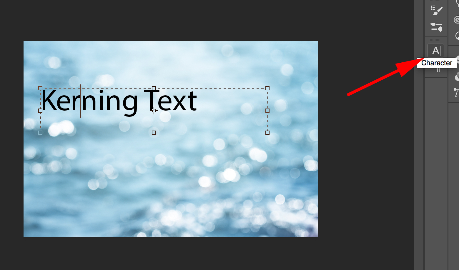
Kerning in Photoshop is incredibly easy, once you figure out where the “Kerning” tool is. If you’re designing a presentation or email template in Photoshop, and your words look a little sloppy, this is an easy way to clean up your text to improve the appearance.
1. First, ensure your cursor is in between two letters. Next, select the “Character” panel, as highlighted by the red arrow below (If you can’t find it, try searching “Character” within the Photoshop search tool).
3. Within the “Character” panel, you’ll see a V/A…
COMMENTS