UX applies to every part of your website, including your web forms, in regards to accessibility, ease of use, and convenience. An online form with great UX is easy for your visitors to work though, simple to understand, and feels professional. What is form UX? Successful form UX ensures your form is easy to use, accessible, convenient, and professional — and, in turn, it helps you boost conversions. Autofill and autocorrect are two features that enhance UX because they simplify the form completion process. Also, because they’re so easy to see, you avoid confusing your visitor when they go to submit their information. Placing your labels inline with your fields is the most thoughtful way to title your fields for your visitors — doing this improves your form’s ease of use since there’s no question about which label belongs to which field. Marking your form fields as required or optional improves UX by making your form accessible to everyone — you provide your visitors with a set of expectations as they fill out your form. Not only does this ensure all of your visitors are on the same page about the information they need to submit, but it also prevents them from having to waste time submitting and re-submitting your forms to try and determine which fields are the necessary ones. Let these examples inspire your own UX design so you can implement the guidelines that fit best with your site, business, and needs to boost conversions and make a great, lasting impression on your visitors.

Think about a website you frequent — what’s that site’s overall functionality like? How long do the pages take to load? Is the site navigation easy to use? Are you able to quickly find the information you’re looking for? These are all aspects of a website’s user experience (UX).
UX applies to every part of your website, including your web forms, in regards to accessibility, ease of use, and convenience. An online form with great UX is easy for your visitors to work though, simple to understand, and feels professional. When your form has all of these factors, you’re likely to see an increase in your number of conversions. That’s why getting your form’s UX right is critical for your business.
What is form UX?
Web form user experience is the process of focusing on how your site visitors interact with every aspect of your form. Successful form UX ensures your form is easy to use, accessible, convenient, and professional — and, in turn, it helps you boost conversions.
Why does form UX matter?
The point of a web form is to collect certain personal information from your visitor, whether that be an email address or their shipping and payment details. But why would a visitor want to convert and conduct any type of business with you if the form they’re being asked to list their information on is difficult to use, hard to understand, or visually unattractive? Simple answer … they wouldn’t.
There are a number of factors that go into great UX and elements to consider when trying to achieve a fantastic and memorable form design. Form UX matters because you want to leave a good (and lasting) impression on your visitors, create a positive experience for them while on your site, and convert more leads.
UX impacts your web form’s level of accessibility (which refers to how easily your forms can be completed and submitted by many types of people, of various backgrounds) and usability (which refers to how easily someone can accomplish their goal, which in this case means completing a form). Without great UX, you’ll not only have poor accessibility and usability but you’ll also lose out on conversions.
10 Form UX Guidelines and Great Examples to Follow
We’ve curated the following list of guidelines that you can apply to your forms to help you enhance their UX. Each guideline also includes an example that you can follow and learn from to help you create successful and thoughtfully-designed web forms for your own site.
1. Enable autofill and autocorrect
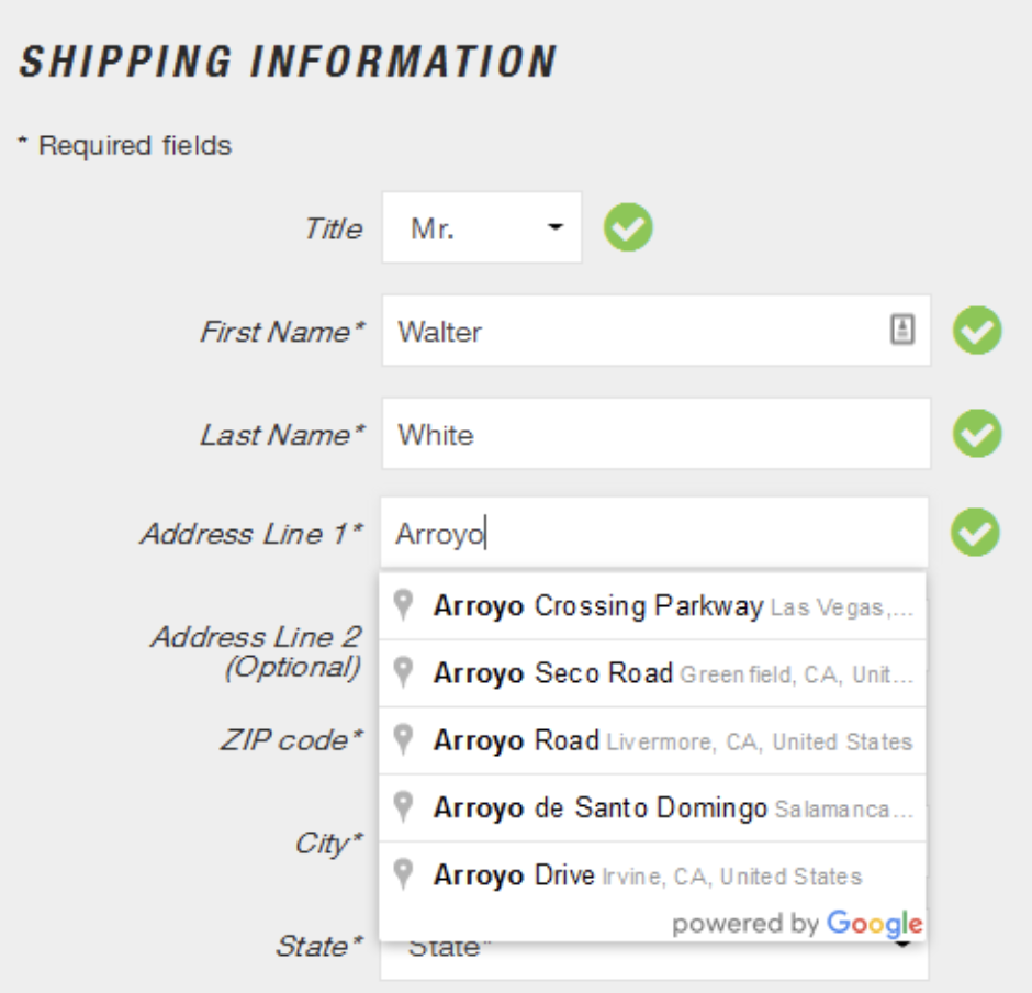
Autofill fills, or completes, form fields based on common attributes or responses, such as name and email, previously provided on the site or in the browser.
Autocorrect corrects, or rectifies, invalid responses visitors may accidentally try entering in the fields. For example, if someone were to enter the incorrect zip code in your form, the form might be able to recommend or fix that error based on someone’s given location or other information they’ve previously submitted.
Autofill and autocorrect are two features that enhance UX because they simplify the form completion process. By enabling these features, you’re not only ensuring valid information is being submitted, but you’re also saving your visitors time, streamlining the form completion process, and helping them remain as efficient and accurate as possible.
2. Exclude all fluff
Keep your form as straightforward and easy to understand as possible by excluding all “fluff” — that is any words, images, fields, or characters that aren’t absolutely necessary. By excluding all unnecessary information, you enhance your form’s UX for a couple reasons. First, it removes any confusion for your visitors that could stem from having too much information. Second, users can submit their information with less friction, like scrolling or trying to determine what’s important.
3. Lay out the form in one column
Your form field…
COMMENTS