")
The pivot table is one of Microsoft Excel's most powerful -- and intimidating -- functions. What Is a Pivot Table? Scenario #1: Comparing Sales Totals of Different Products Say you have a worksheet that contains monthly sales data for three different products -- product 1, product 2, and product 3 -- and you want to figure out which of the three has been bringing in the most bucks. You could, of course, look through the worksheet and manually add the corresponding sales figure to a running total every time product 1 appears. In order to get accurate data, you need to combine the view totals for each of these duplicates. How to Create Pivot Tables in Excel Now that you have a better sense of what pivot tables can be used for, let's get into the nitty-gritty of how to actually create one. Step 1: Highlight Your Cells to Create the Table If you've already entered data into your Excel worksheet, highlight the cells you'd like to summarize in a pivot table, click "Insert" along the top navigation, and select the "PivotTable" icon. Note: If you're using a version of Excel earlier than Excel 2016, "PivotTables" may be under "Tables" or "Data" along the top navigation, rather than "Insert." To do that, you'd simply click and drag the “Title” field to the "Row Labels" area. If were the case, Excel's Sort function can help you out.

The pivot table is one of Microsoft Excel’s most powerful — and intimidating — functions. Powerful because it can help you summarize and make sense of large data sets. Intimidating because you’re not exactly an Excel expert, and pivot tables have always had a reputation for being complicated.
The good news: Learning how to create a pivot table in Excel is much easier than you might’ve been led to believe. But before we walk you through process of creating one, let’s take a step back and make sure you understand exactly what a pivot table is, and why you might need to use one.
What Is a Pivot Table?
A pivot table is a summary of your data, packaged in a chart that lets you report on and explore trends based on your information. Pivot tables are particularly useful if you have long rows or columns that hold values you need to track the sums of and easily compare to one another.
In other words, pivot tables extract meaning from that seemingly endless jumble of numbers on your screen. And more specifically, it lets you group your data together in different ways so you can draw helpful conclusions more easily.
The “pivot” part of a pivot table stems from the fact that you can rotate (or pivot) the data in the table in order to view it from a different perspective. To be clear, you’re not adding to, subtracting from, or otherwise changing your data when you make a pivot. Instead, you’re simply reorganizing the data so you can reveal useful information from it.
How to Use Pivot Tables
If you’re still feeling a bit confused about what pivot tables actually do, don’t worry. This is one of those technologies that’s much easier to understand once you’ve seen it in action. So, here are two hypothetical scenarios where you’d want to use a pivot table.
Scenario #1: Comparing Sales Totals of Different Products
Say you have a worksheet that contains monthly sales data for three different products — product 1, product 2, and product 3 — and you want to figure out which of the three has been bringing in the most bucks. You could, of course, look through the worksheet and manually add the corresponding sales figure to a running total every time product 1 appears. You could then do the same for product 2, and product 3, until you have totals for all of them. Piece of cake, right?
Now, imagine that monthly sales worksheet of yours has thousands and thousands of rows. Manually sorting through them all could take a lifetime. Using a pivot table, you can automatically aggregate all of the sales figures for product 1, product 2, and product 3 — and calculate their respective sums — in less than a minute.
Scenario #2: Combining Duplicate Data
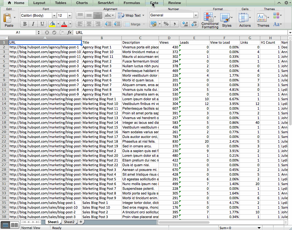
In this scenario, you’ve just completed a blog redesign and had to update a bunch of URLs. Unfortunately, your blog reporting software didn’t handle it very well, and ended up splitting the “view” metrics for single posts between two different URLs. So in your spreadsheet, you have two separate instances of each individual blog post. In order to get accurate…
COMMENTS