
How to Make Your Mobile Site Load Faster. Your users expect your site to load fast. Test your site speed Before you do anything else, you should test how fast your mobile site really is. Perfect your mobile site design Think back to when you designed your site. To do that, your site needs to make use of responsive design. But responsive design is just one step toward perfecting your site. Especially mobile sites. When it comes to mobile design, less is often more. It makes sure your site is only using the code it needs. I’ve consulted on hundreds of websites, and I always steer my clients’ attention to mobile performance.

If you take a look through my articles, you’ll see I talk about mobile-first thinking a lot.
Why do I make such a big deal about this?
Because mobile is the reality of today’s digital world.
In fact, mobile is more important than desktop.
51.3% of all Internet usage is mobile. And that number will continue to grow in the future.
That’s why I’ve been advising my clients to focus more on mobile than on desktop, and that’s exactly what I recommend to you.
Specifically, you should focus on your mobile site.
A responsive site with unobtrusive popups is the current standard for mobile.
In addition, all of the regular website optimization best practices that apply to desktop also apply to mobile.
Today, the best practice I want to talk about is speed.
Your users expect your site to load fast. If it doesn’t, you could lose a ton of traffic.
How fast, you ask?
73% of mobile Internet browsers say they’ve encountered sites that took too long to load, and 40% abandon a site if it doesn’t load in 3 seconds or less.
Some research even suggests that if a page doesn’t load in the literal blink of an eye, people could lose interest. That’s about 400 milliseconds.
Not to mention the mighty Google takes site speed into account when indexing and ranking sites.
So if your site isn’t fast, both your audience and Google will think poorly of it. You’ll lose visibility and traffic.
So, how fast is your site?
Because if it takes longer than 2 or 3 seconds to load, you’re losing traffic right this moment.
It’s okay if your site is slow. There are steps you can take to make it faster to ensure you don’t let a single visitor slip through your fingers.
Test your site speed
Before you do anything else, you should test how fast your mobile site really is.
You might think it loads just fine, but it could be slower than you think.
One of the best mobile tests is from Think With Google:
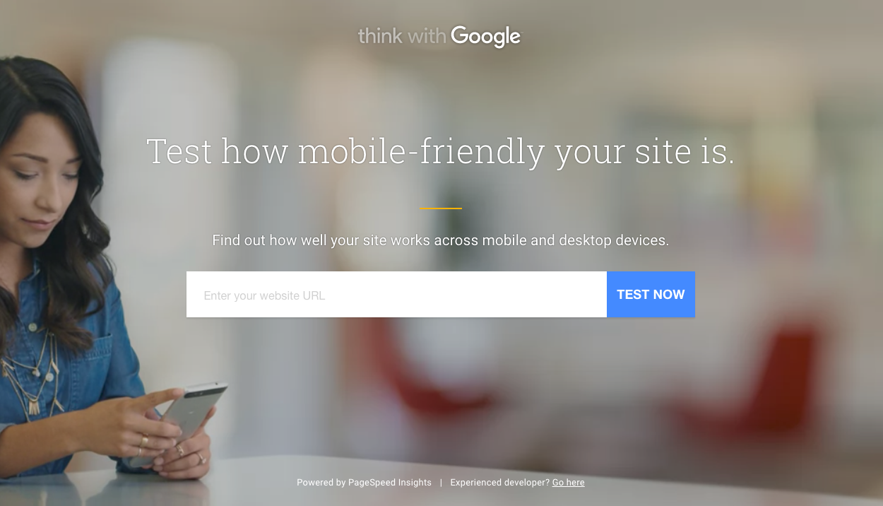
Enter your URL into the search bar and click “Test Now.”
You’ll want to enter your regular URL and not your mobile URL if you have one (e.g., m.site.com).
We’ll test Amazon.com because it has a lot of mobile shoppers.

The test will analyze your site using a thorough set of tests and show you how well your site performs.

This process should take about a minute or two.
Once it’s finished, you’ll see three scores:
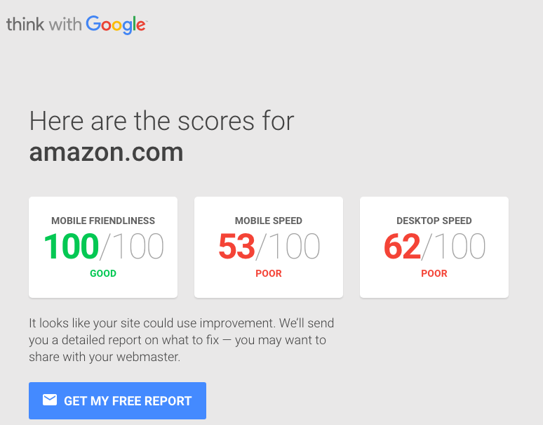
You’ll want to pay the most attention to the first two scores: mobile friendliness and mobile speed.
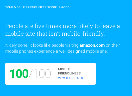
Mobile friendliness reflects how easy your site is to use on mobile. It’s an overall performance metric.
Amazon has a perfect mobile friendliness score:
But what’s interesting is that it has a rather low mobile speed score. The test rates it as poor.
The site offers a free report to help diagnose any issues, and I recommend taking a look at it for tips that are specific to your site.
I’m going to address the most common causes of slow mobile sites and explain what you can do to improve yours.
Perfect your mobile site design
Think back to when you designed your site.
Did you have mobile devices in mind?
I’m guessing you didn’t. (If you did, give yourself a pat on the back.)

That’s perfectly okay if you didn’t, but now is the time to rethink your design with a mobile-first mindset.
Mobile sites have changed a lot in the last few years.
It used to be that sites would have two versions, one for mobile and one for desktop.
A mobile site is easily identified by the “m.” subdomain:
In this situation, the mobile and desktop sites are two completely different animals operating separately from one another.
Think of it like a fast-food restaurant with a drive-through. The desktop site is the main part of the restaurant, and the mobile site is the drive-through.
Often, that means the mobile site only offers a fraction of the experience the desktop version does, much like a drive-through doesn’t offer the full experience of dining in.
But you want your users to have the best mobile experience possible.
To do that, your site needs to make use of responsive design.
Responsive design allows you to have one site that dynamically changes depending on how it’s being accessed.
So your mobile and desktop users will be looking at the same site, but it will appear differently on each device.
This is actually what Google prefers. They state it quite simply: “Responsive design is Google’s recommended design pattern.”
You’re probably thinking, “Okay, cool, but what does this have to do with speed?”
Responsive designs typically load faster than mobile-only sites, so you’re gaining a massive SEO advantage there.
And if you use a responsive design, your site will get more attention in the form of social shares, which will also boost your SEO.
Making your site responsive is good for both the short term and the long term. If you don’t already have a responsive site, I recommend looking into it as soon as you can.
But responsive design is just one step toward perfecting your site.
There are a few other design aspects you need to consider.
Keep your site lightweight
It’s easy to get caught up in making the best and most eye-catching design out there.
Sometimes you get too caught up, and as a result, your site gets slower and slower because you keep adding more and more.
This is a condition that developers call code bloat.
Code bloat happens when your site gets weighed down with excess code.

Most of the time, code bloat happens when a designer is too focused on the visual presentation of a site.
Don’t get me wrong. How a site looks is extremely important.
But performance can’t take a backseat to looks.
Luckily, it doesn’t have to. You…
COMMENTS