
Best Mobile Websites Shutterfly Google Maps Typeform Etsy Adrian Zumbrunnen Elf on the Shelf BuzzFeed Evernote Huffington Post Express Nationwide Insurance Squaredo Zappos Scroll down, and users will see large buttons that make it easy for users to quickly select which type of product they're interested in. BuzzFeed knows that a lot of their visitors are visiting their site on mobile, so they've taken great care to create a smooth experience for their on-the-go readers. Because users tend to download the app or access the website on multiple devices including desktop computer, smartphone, and tablets, it's essential that Evernote get the mobile experience right. If you look at Evernote's homepage on your desktop computer, you'll notice how clean the design is. When you arrive on Nationwide's mobile site, you'll see two tabs at the top allowing you to identify as one of two types of users right away to customize your experience: Personal or Business. Their top priority on mobile is to help users search easily for the items they're looking for on their website, so they've put a large search bar at both the top and bottom of their mobile website to make it super easy for them. Users visiting ABC's desktop website are greeted with these options and more. Lean Labs is a marketing agency that creates engaging, responsive, and high-conversion web solutions. Want more information on how to optimize your business for mobile devices?
Now more than ever, businesses are focusing on creating delightful mobile website experiences.
After all, Google has been heavily favoring mobile-friendly websites since 2015 when it updated its ranking algorithm in April 2015, and then started indexing mobile sites in March 2018.
And that’s crucial, seeing as there have been more Google search queries on smartphones than on desktop computers and tablets for over a year now.
Going forward, Google will only continue to raise the bar for what it considers to be mobile-friendly (including page load time) and reflect that in its algorithm updates. So if you haven’t been focusing on improving your mobile experience, you’d better prioritize it now, or your search ranking could really suffer. Additionally, HubSpot Research found that half of US consumers are going online on their phones more than on their computers or tablets.
To help inspire any mobile website design changes you’ll be making, here’s a list of 19 companies who really nailed their mobile web experience.
Best Mobile Websites
- Shutterfly
- Google Maps
- Typeform
- Etsy
- Adrian Zumbrunnen
- Elf on the Shelf
- BuzzFeed
- Evernote
- Huffington Post
- Express
- Nationwide Insurance
- Squaredo
- Zappos
- ABC
- Lean Labs
- SAP
- KISSmetrics
- idig Marketing
- IndiaMART
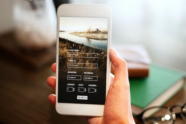
Shutterfly is an online service that allows users to create photo books, personalized cards and stationary, and more. Because more and more people are taking photos and then accessing them using their smartphones, Shutterfly recognized the need to create a great mobile experience for their customers — and they delivered.
Shutterfly accomplishes two key goals on their mobile website:
- It’s easy for users to find out information about their offerings.
- They’re selling that information by way of beautiful imagery.
When you arrive on their mobile site, you’ll see Shutterfly’s latest promotion front and center, as well as a large finger-sized sign-in button for returning members — neither of which overpower the user experience.
Scroll down, and users will see large buttons that make it easy for users to quickly select which type of product they’re interested in. Once users click through to one of those options, they’re greeted with large photos showcasing what Shutterfly is capable of for easy browsing.
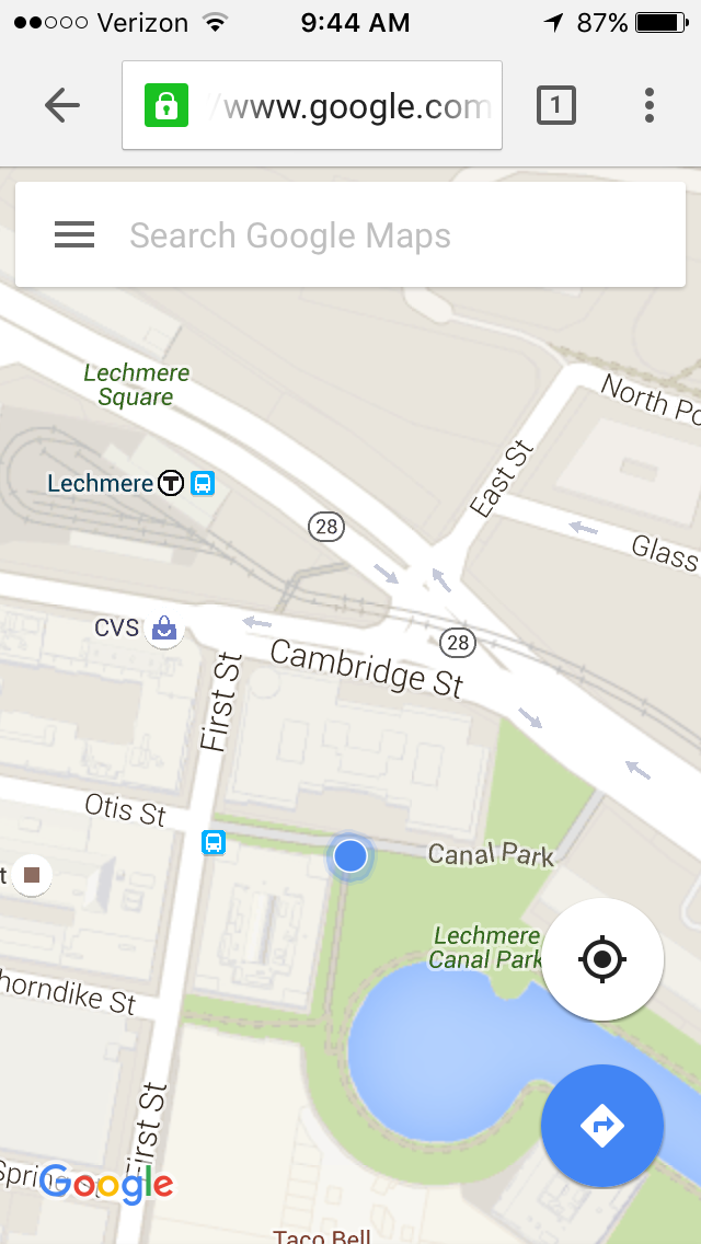
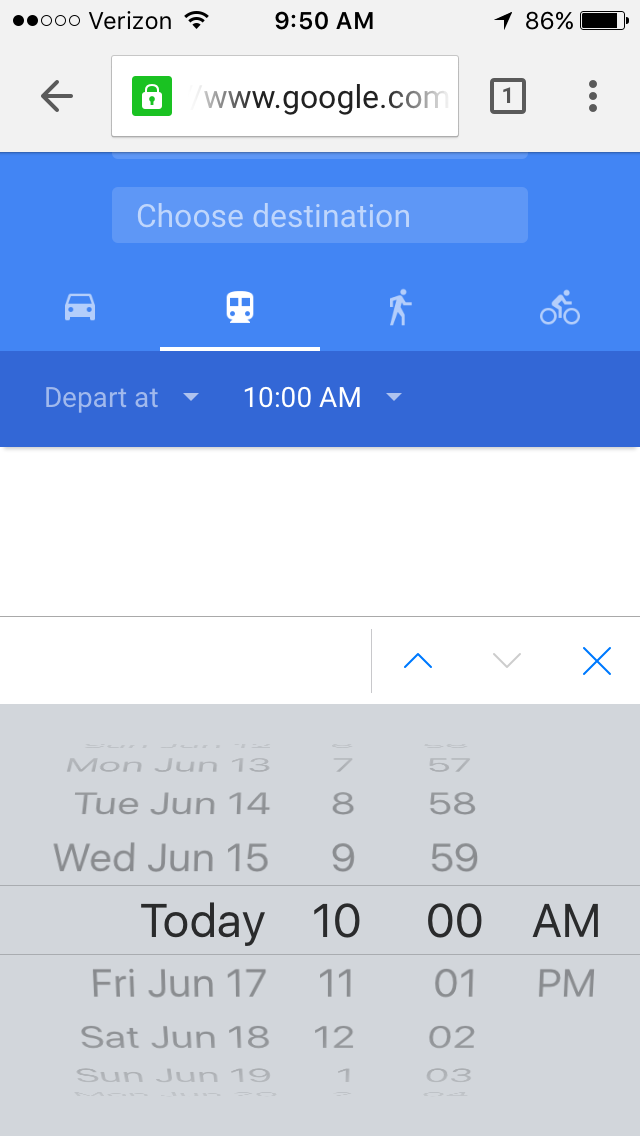
Everyone has their favorite map or directions application. Mine is Google Maps, which I use whether I’m walking, driving, biking, or taking public transportation. What’s special about their mobile website is that it’s virtually indistinguishable from their downloadable mobile app.
The screenshots below are taken of their mobile website, but if you’re familiar at all with the app, you’ll notice they look exactly the same. Not only is the appearance identical, but the mobile website has the speed and functionality of the app.
Typeform is a Barcelona-based tech company with one simple mission: to “make forms awesome.” Their desktop website is really beautifully designed, greeting visitors with succinct copy, high-definition videos, relevant animations, and other, more complex design components.
But for mobile users, they recognized that complex design components like video and animations could significantly affect page load time, among other difficulties. That’s why they actually removed many of them — which decluttered the site and simplified the overall mobile experience. The mobile website is a simpler version of their desktop website, and it’s still beautifully designed.
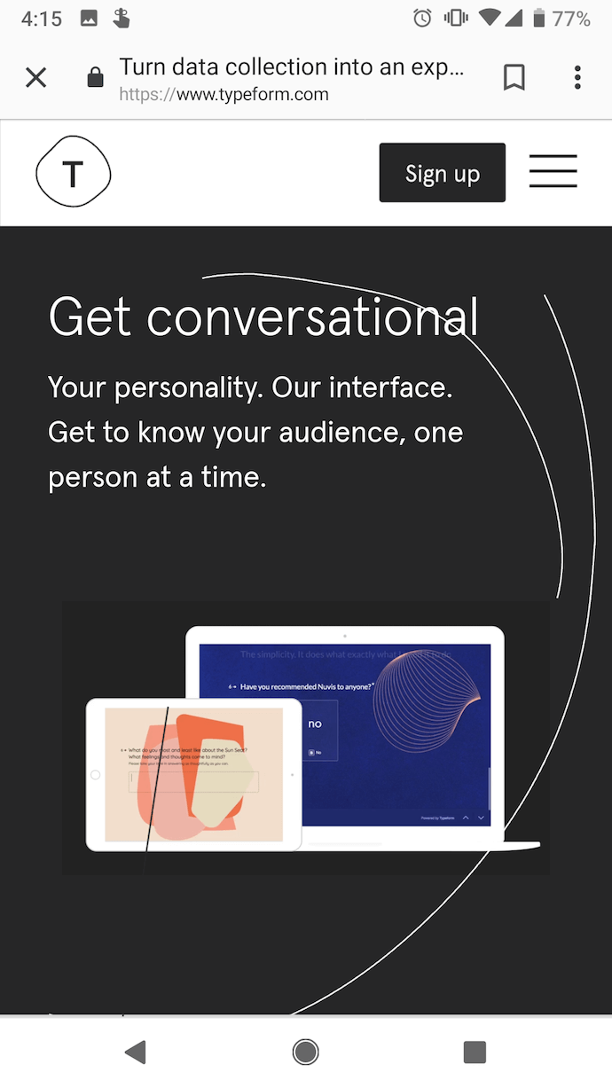
Take note of the large buttons on their menu page — perfect for tapping with your finger on a mobile screen.

4. Etsy
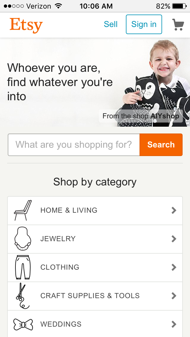
Etsy is an ecommerce website where people can buy and sell vintage or handmade items. Most buyers who visit Etsy’s website are there to do one of two things: Either they’re searching for a specific item, or they’re browsing items in categories that interest them.
The mobile website caters to both types of visitors from the very beginning. When you first go to their mobile website, you’re greeted with an option to search for specific items, shops, or categories.
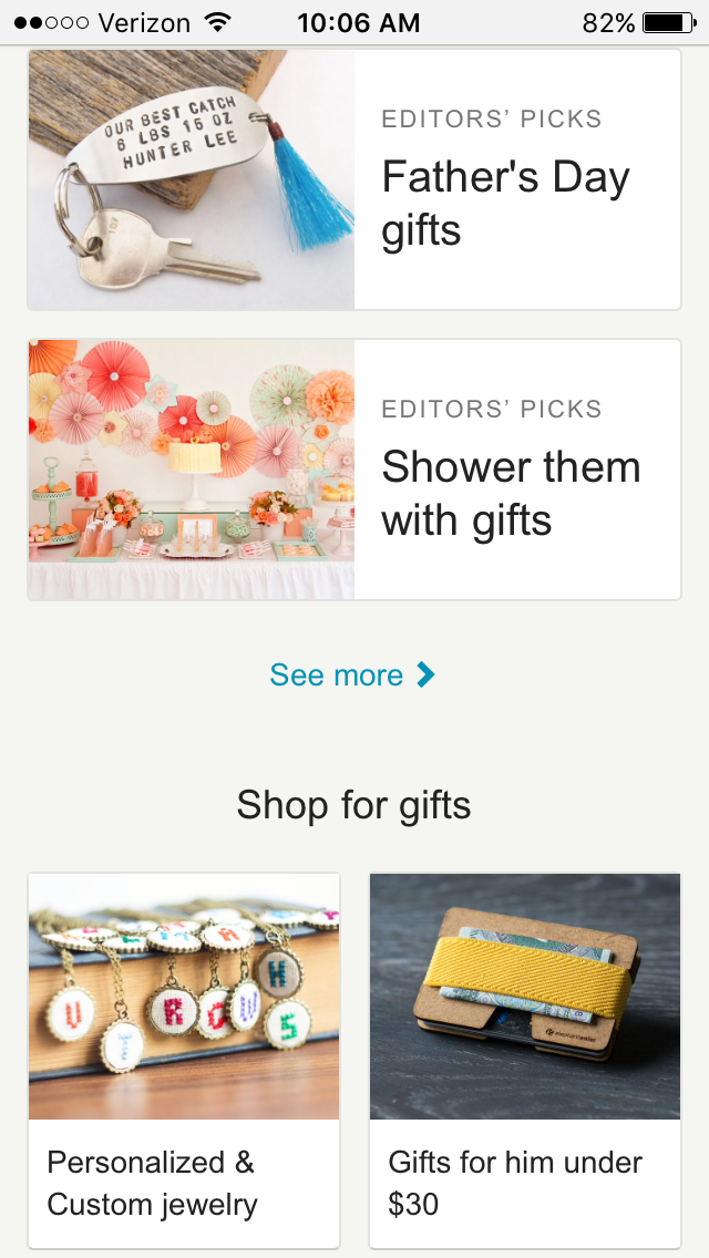
Immediately below the search bar are thumbnail images of trending items that showcase some of the most popular things you can buy on Etsy. Mobile users can view these trending items in a collage format, and the images are big enough for them to easily tap with their finger.
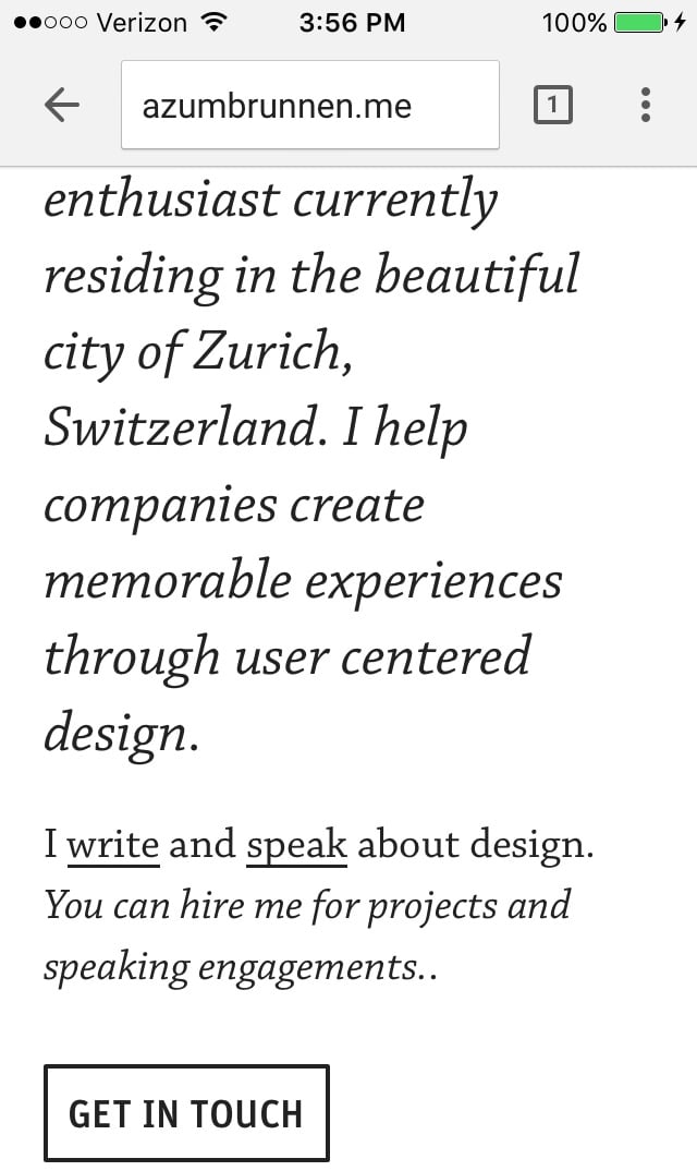
This is the personal website of Adrian Zumbrunnen, a UX designer, writer, and speaker. When you visit his website, you’ll notice right away there’s something very unique about it: It’s a conversational website.
It almost looks like a text message conversation you’d normally have on your phone — including the ellipsis to show he’s “typing.” Users are given two response options at the end of every exchange, so it’s kind of like a “choose-your-own-adventure” experience.
While the mobile and desktop experience are very similar, the desktop website feels like it was made primarily for mobile — which could be the direction sites will go in the future.
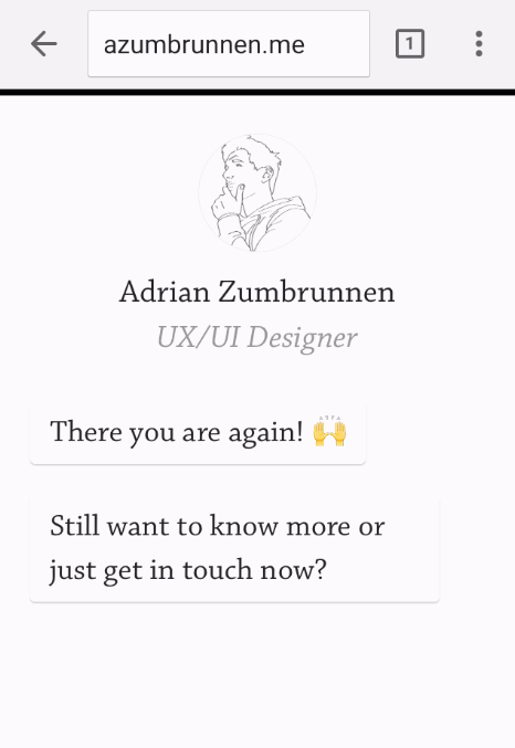
And if you’d prefer not to engage in the conversation-like exchange, you can simply scroll down for details.
Elf on the Shelf is, relatively speaking, a fairly new Christmas tradition based on a children’s book. If you’re unfamiliar, the basic premise is this: The book tells the story of Santa’s scout elves, who are sent by Santa to watch over children in their homes all over the world and report back to Santa.
Along with the book, parents can purchase an elf figurine, which they’ll subtly place somewhere in their house where their kids can see it. Every night leading up to Christmas, parents move the elf to a different location around their house to “prove” to their kids that the scout elves are real and always looking over them.
When you first arrive on Elf on the Shelf’s website, you’ll see there are actually numerous types of Elf on the Shelf products you can purchase. But instead of forcing users to scroll through each product individually, the web designers package each product into a large, enticing tile describing the goal of each buyer’s journey, with the featured item displayed on the front.
You’re not buying your own elf or pup — you’re adopting it. It’s a truly empowering experience on such a small screen.

BuzzFeed is a news company known for it’s viral content and popular quizzes. It also happens to be one of my favorite sources of entertainment during my commute to and from work.
And where do you think I’m checking BuzzFeed during my commute? You guessed it: on my phone. BuzzFeed knows that a lot of their visitors are visiting their site on mobile, so they’ve taken great care to…
COMMENTS