
If your website visitors aren’t converting, your ecommerce site won’t make money. If your checkout process isn’t secure, people won’t feel safe entering their credit card information, which is ultimately what you need to make money. If it costs you money to ship your products, that means you should charge your customers for shipping, right? In fact, shipping costs play a major role in why shopping carts are abandoned in the United States: Do not charge your customers for shipping. Do you need the customer’s name? Customers can save their payment information to their accounts, which reduces the number of steps in the checkout process and makes it easier for them to convert. A/B test the elements of your checkout process You can never truly be sure your checkout process is designed for the maximum number of conversions unless you put your theory to the test. You don’t want your customers to leave your site without buying anything because you don’t accept the payment method they want to use. Conclusion If you’re driving lots of traffic to your ecommerce site but those visitors aren’t converting, you need to analyze the design of your checkout process. Optimize your ecommerce site for mobile devices.
Ecommerce websites live and die by their conversions.
For those of you who have a high volume of traffic to your website, that’s great news. But traffic alone doesn’t generate sales.
Is your website traffic translating to conversions?
There are certain metrics you can use to measure this. Look at your bounce rates. Analyze your shopping cart abandonment rates.
If your website visitors aren’t converting, your ecommerce site won’t make money.
Don’t get me wrong: the products you’re selling might be amazing. That’s not necessarily the issue here.
The design of your website and the checkout process might be what’s hurting you.
For the most part, simple website designs have higher conversion rates. This same concept needs to be applied to your checkout process.
The information in this guide will help you identify any flaws with your checkout procedure that could be hindering your conversions.
If you have just launched a startup company and are in the process of designing your website for the first time, these useful tips and best practices will help you as well.
Here’s what you need to do to design a checkout process that converts.
Add multiple checkout buttons
For website visitors to make a purchase, they need to be able to navigate to your checkout page.
Once someone decides to buy, they’ll add the items they want to their shopping cart. In a perfect world, you want them to continue shopping so they spend more money.
But if the checkout buttons aren’t clearly labeled, the customer may ultimately leave the items in the cart without buying them.
This could be why your shopping cart abandonment rates are so high. Instead, include checkout buttons on both the top and bottom of the screen.
Check out this example from the Champs Sports website:
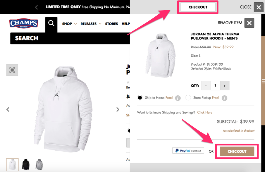
Positioning the checkout buttons in two places ensures the visitor will see and have access to both buttons.
The word “checkout” will stay in their line of vision, regardless of where they’re looking on the screen.
I also want you to notice that the location of the shopping cart on the right side of the screen allows the customer to continue shopping on the left.
This increases the likelihood that the average order amount will be higher and conversion rates remain high as well.
You can implement the same strategy on your ecommerce page to drive sales.
Secure the checkout process
Security needs to be a top priority for your ecommerce site. If your pages appear untrustworthy, people won’t want to buy anything.
In the past five years alone, 46% of people in the United States have been affected by credit card fraud.
There’s a high probability that nearly half of your website visitors have experienced this. Even if they haven’t personally fallen victims to fraud, I’m sure they know at least one person who has.
This puts people on high alert.
If your checkout process isn’t secure, people won’t feel safe entering their credit card information, which is ultimately what you need to make money.
You must understand and implement the top elements that add credibility to your website.
All pages of the checkout process must be secure. It’s also in your best interest to include security badges, such as Norton, McAfee, or whatever else you’re using to protect your customers.
Eliminate shipping costs
Here’s a common mentality I see from ecommerce sites all the time. If it costs you money to ship your products, that means you should charge your customers for shipping, right?
Wrong.
While this may sound like a reasonable justification to you, your customers don’t see it that way.
In fact, shipping costs play a major role in why shopping carts are abandoned in the United States:
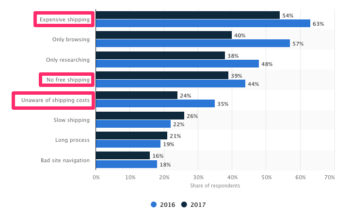
Do not charge your customers for shipping.
But you still need to make sure you’re turning a profit, even if you’re offering free shipping.
You’re better off raising the prices of your items so that the shipping costs are built into the base prices. Psychologically, this won’t impact your conversions.
That’s because customers won’t be surprised when they see additional charges when they check out. If your product is listed for $50 on the site, that’s what they expect to pay. But if the costs add up to $70 with taxes and shipping, it’ll hurt your conversions.
I’m not expecting you to be unrealistic here. Don’t ship your customers a piano overnight for free.
All I’m saying is you shouldn’t charge for standard ground shipping. If a customer wants the delivery to be expedited, you can let them pay an additional charge.
Reduce the number of form fields
A website visitor is ready to buy something. They’ve already made up their mind.
Don’t give them a chance to change their mind and abandon the cart. If your checkout process is…
COMMENTS