
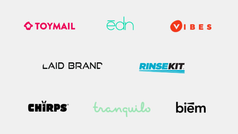
On ABC's Shark Tank, companies only have a few minutes to pitch their business to the panel of investors, which means their logo needs to say a lot about what kind of business they are. I've examined 96 companies from Shark Tank, Season 8 (check the full list here) and selected the best Shark Tank logos, explaining in-depth why each logo works and which design elements make it great. So whether you're a designer looking for some inspiration or an entrepreneur looking for logo design ideas for your business -- you're in the right place! 8 Best Shark Tank Logos Toymail Edn Vibes LaidBrand RinseKit Chirps Tranquilo Biem How do you judge a logo? A good logo is distinctive, appropriate, practical, graphic, simple in form, and conveys an intended message. Principles of a Good Logo I have judged all the Shark Tank logos by the following five criteria: Simplicity: Is the design simple and clean enough to be flexible and easily recognizable? The wordmark feels very light and clean. Whether you are trying to attract a mate or just exude that extra boost of confidence, pheromones play a huge part in achieving those desires. It is a crisp and bold icon that has a great presence. The beam is neither too big nor too small to serve as a graphic trigger for something memorable.

If you’re a young startup just beginning to find your footing in the business world, having a quality, professional-looking logo can help you look great in front of potential investors and clearly establish what your brand stands for.
Designing a logo that is simple enough to be absorbed and understood quickly, but still conveys the many meanings a brand might depend on is not an easy task. Generating creative logo ideas can be very time-consuming.
On ABC’s Shark Tank, companies only have a few minutes to pitch their business to the panel of investors, which means their logo needs to say a lot about what kind of business they are.
I’ve examined 96 companies from Shark Tank, Season 8 (check the full list here) and selected the best Shark Tank logos, explaining in-depth why each logo works and which design elements make it great.
The process of designing a logo requires an enormous amount of patience and an obsession with getting it right. So whether you’re a designer looking for some inspiration or an entrepreneur looking for logo design ideas for your business — you’re in the right place! Check out my analysis of the logos below to inspire your own design.
8 Best Shark Tank Logos
- Toymail
- Edn
- Vibes
- LaidBrand
- RinseKit
- Chirps
- Tranquilo
- Biem
How do you judge a logo?
A good logo is distinctive, appropriate, practical, graphic, simple in form, and conveys an intended message. The most successful companies continue to say:
Simpler is better.
And these companies definitely made the right hiring decision, whether they hired an independent design or a design agency, their logos came out well executed.
I’m going to judge these Shark Tank logos only in terms of their pure visual aesthetics without discussing the whole identity system, and how these logos work on the applications like websites, stationery design etc.
Simple ≠ Easy
Remember that the simplest ideas often require many hours of tweaking design concepts. Simplicity is something that is achieved by eliminating unnecessary elements — going from a visual clutter to a visual essence.
Principles of a Good Logo
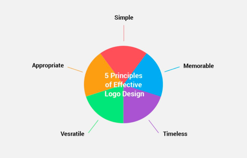
I have judged all the Shark Tank logos by the following five criteria:
- Simplicity: Is the design simple and clean enough to be flexible and easily recognizable? Is it not too busy, distracting, or confusing?
- Memorability: Is it quickly recognizable? Is it clever? Will people only have to spend a second or two thinking about it to get it?
- Timelessness: Will it still be a great logo in 10, 20, or even 50 years?
- Versatility: Does it scale to different sizes without losing quality or clarity? Will it work across various media and within different contexts?
- Appropriateness: Does it resonate with the desired audience and industry of the business?
COMMENTS